Expenza
An editorial, gesture-driven mobile expense tracker engineered around a signature Shake-to-Add physical interaction, warm neutral minimalism, and a 100% local-first data architecture.
- Type
- Product design & working mobile application
- Role
- Product designer & mobile architect
- Platform
- iOS and Android (React Native & Expo)
- Tools
- Figma, React Native, Sharp
The friction problem in personal finance
Most personal finance applications fail not from a lack of features, but because of excessive interaction friction. When walking away from a coffee counter or grocery checkout, users have less than five seconds of active attention before pocketing their phone. Traditional capture flows requiring multi-level submenus, authentication walls, and cloud sync result in deferred tracking, inaccurate totals, and eventual app abandonment.
Expenza is built from the opposite principle: sub-three-second capture. By replacing UI navigation with physical intent, the app bridges the critical gap between immediate transaction capture and meaningful long-term financial awareness.
Physical intent over UI navigation: Shake-to-Add
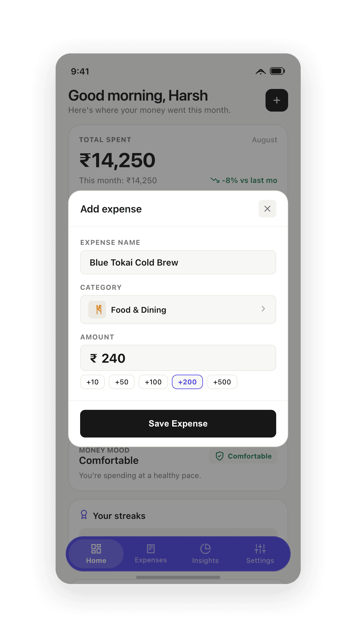
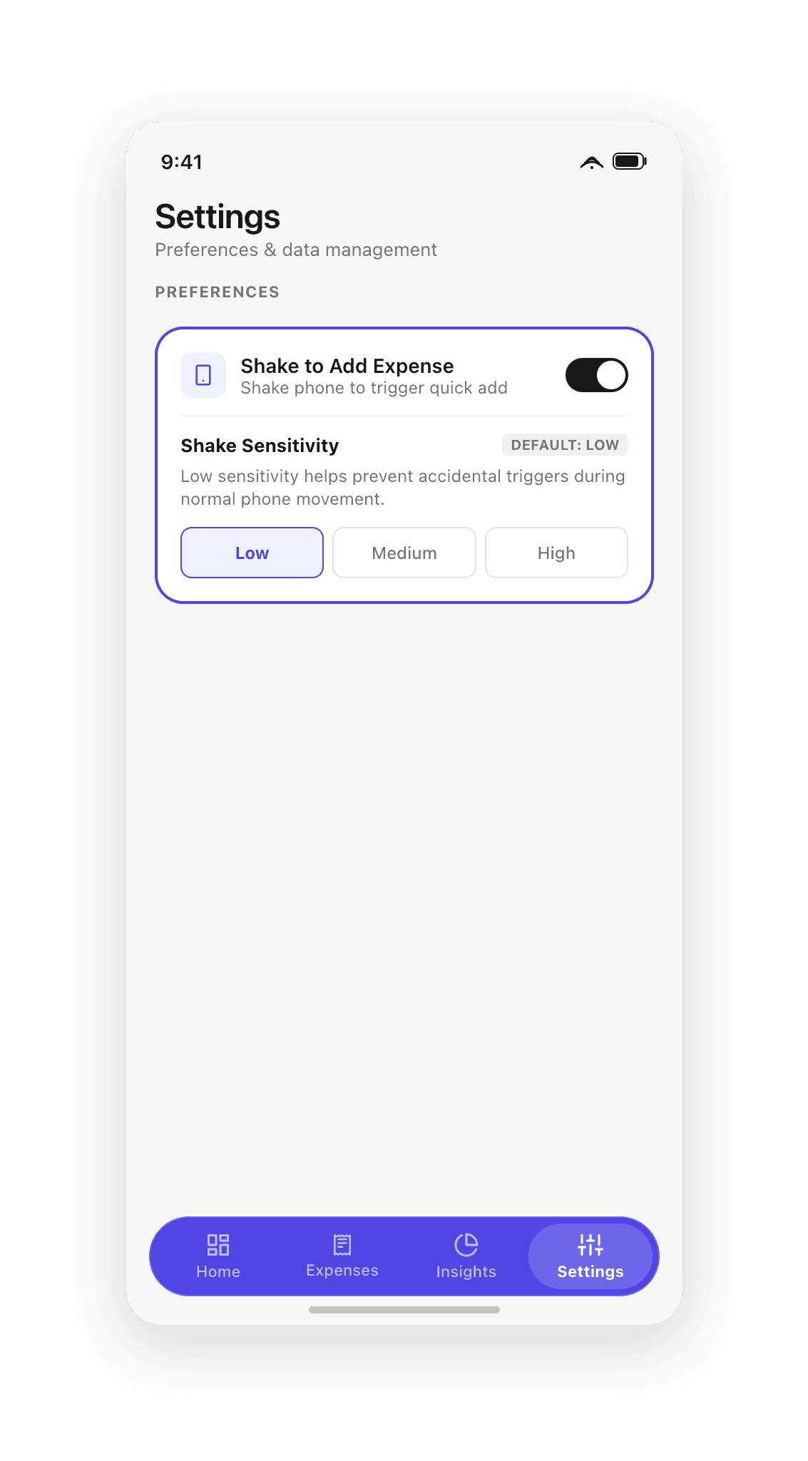
Rather than hunting for a floating action button or drilling into a menu, users simply flick their wrist. A custom accelerometer filter computes coordinate deltas across three axes (Δ > 3.0G) paired with a 1,500ms debounce cooldown to eliminate pocket false positives while preserving instant responsiveness.
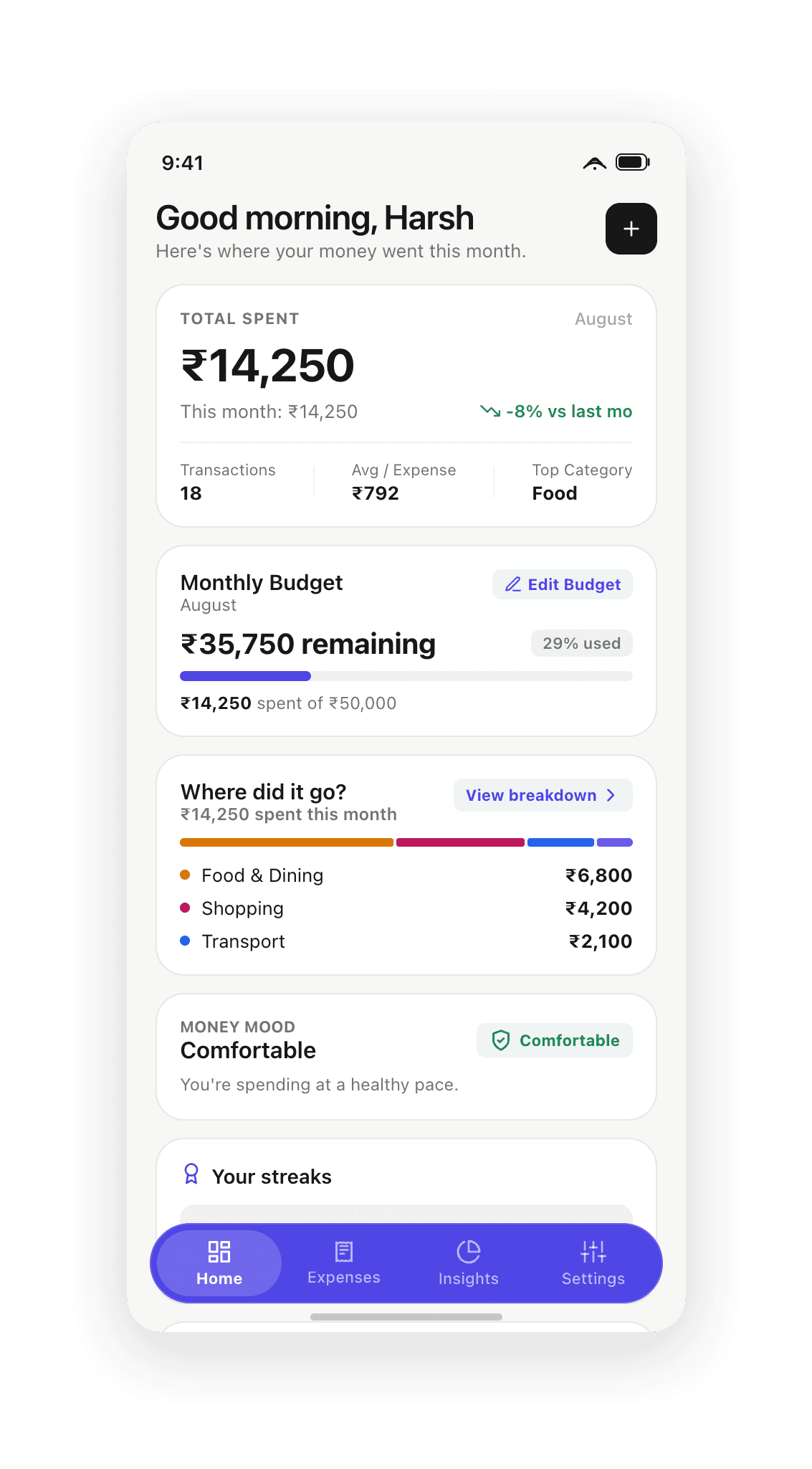
The resulting modal auto-focuses the input, defaults to recent context, and presents quick-increment chips (+10, +50, +100, +200, +500) so round transactions can be logged in a single tap without invoking the keyboard. When minimized, a native foreground service triggers a tactile haptic pulse and delivers a direct deep-link notification.
Warm editorial clarity without drop shadows
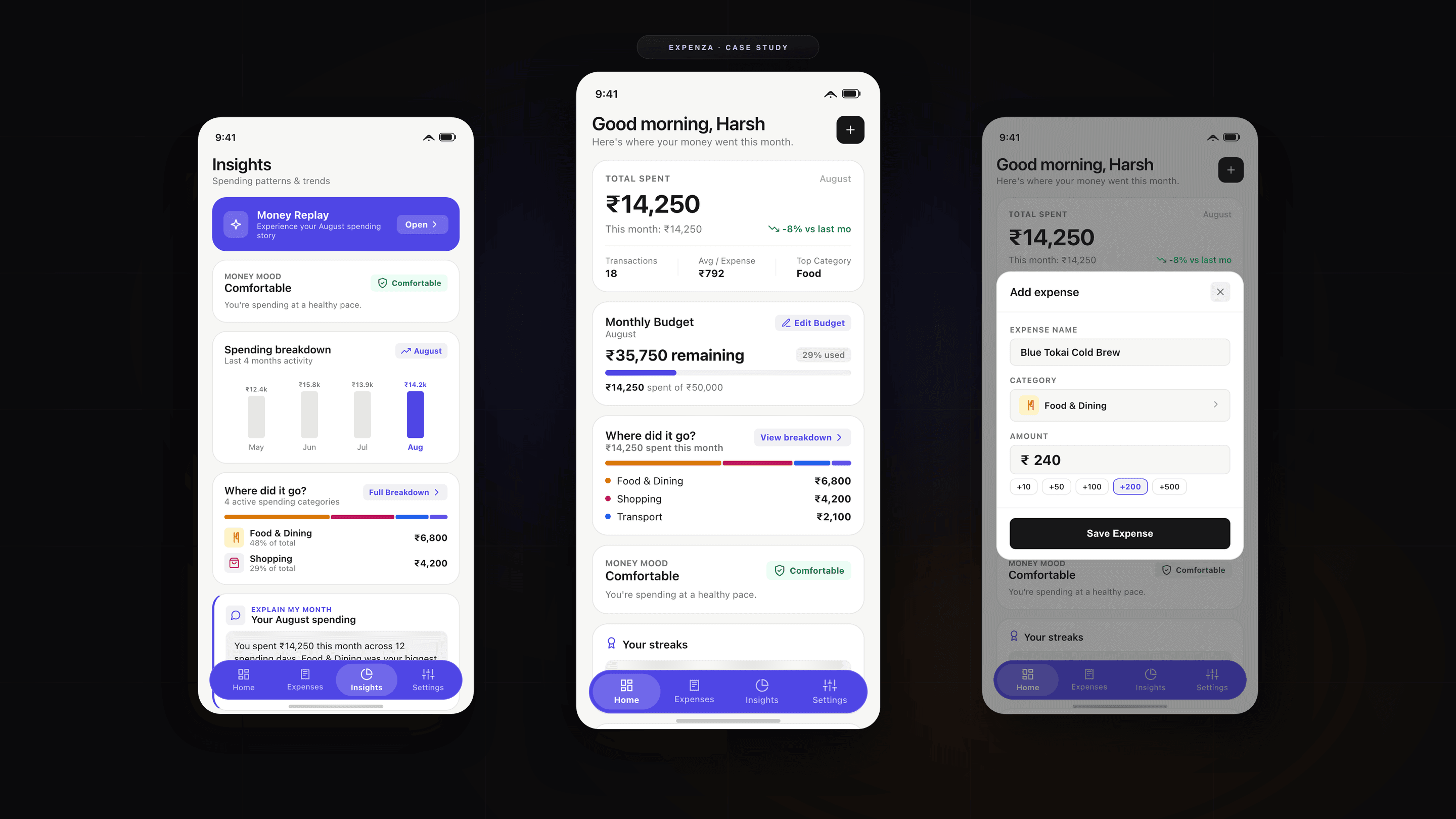
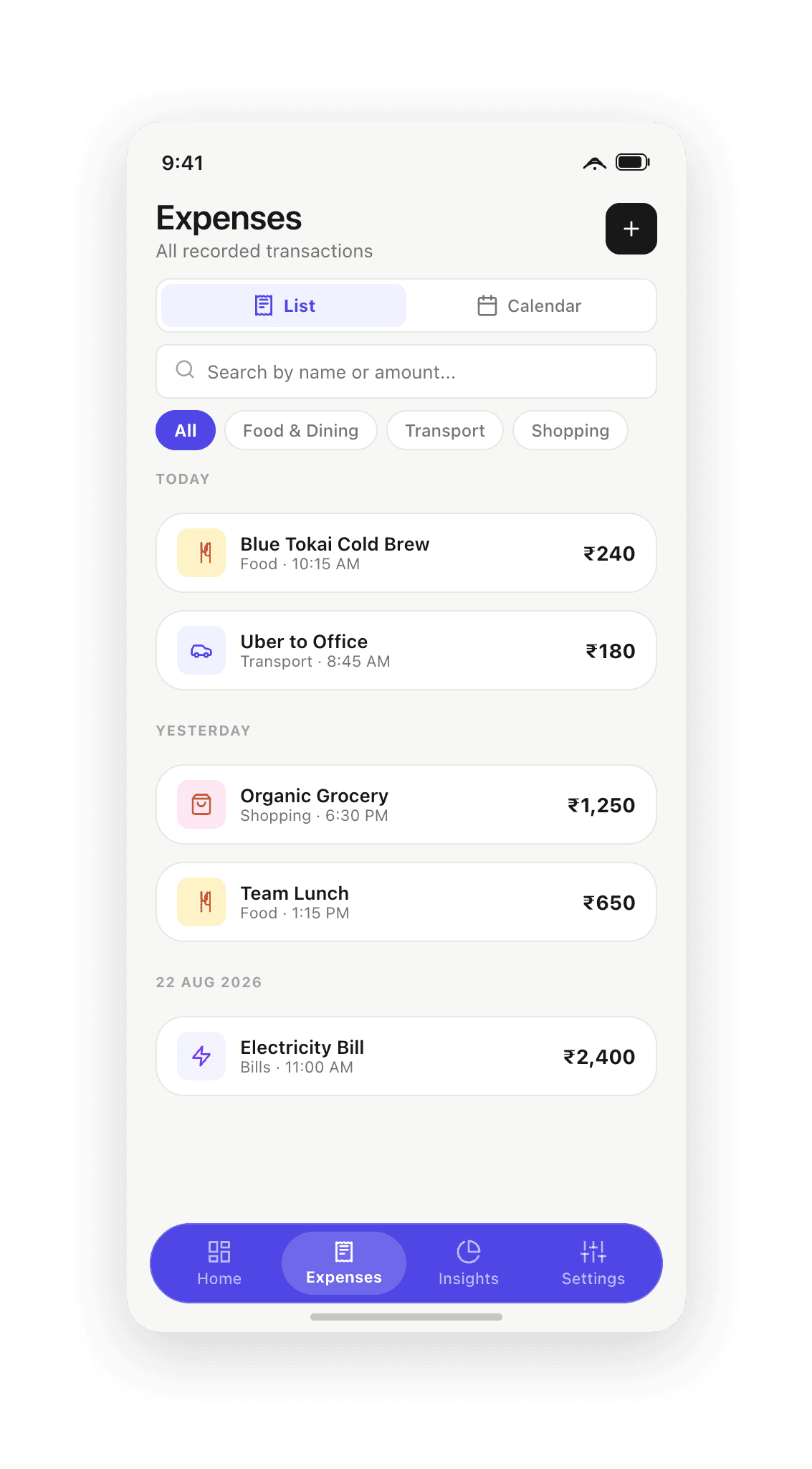
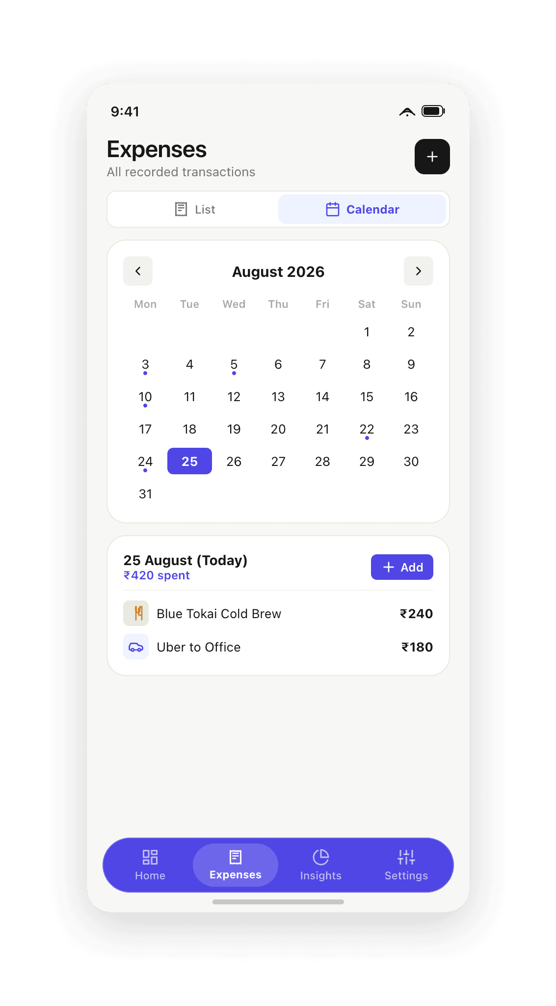
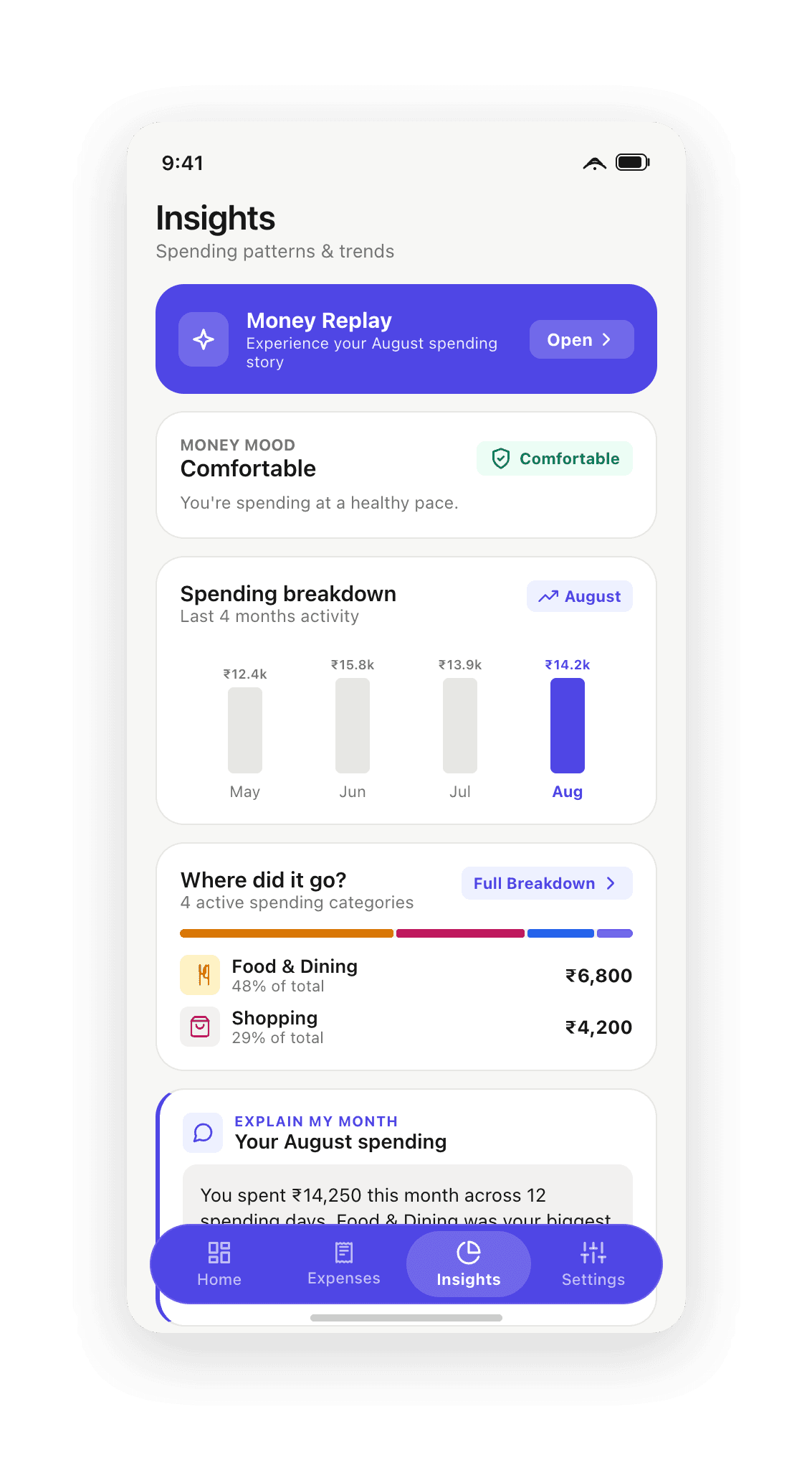
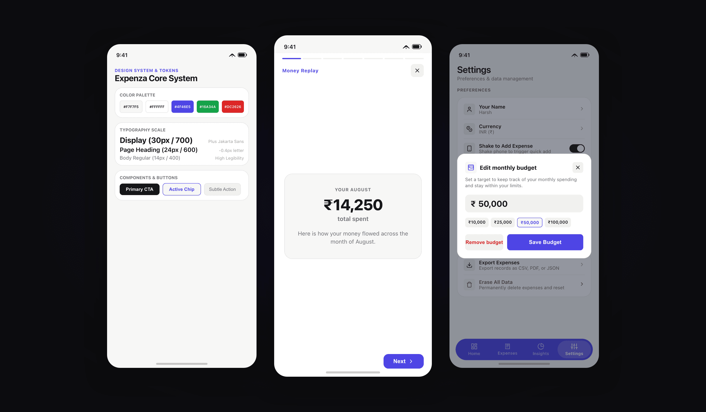
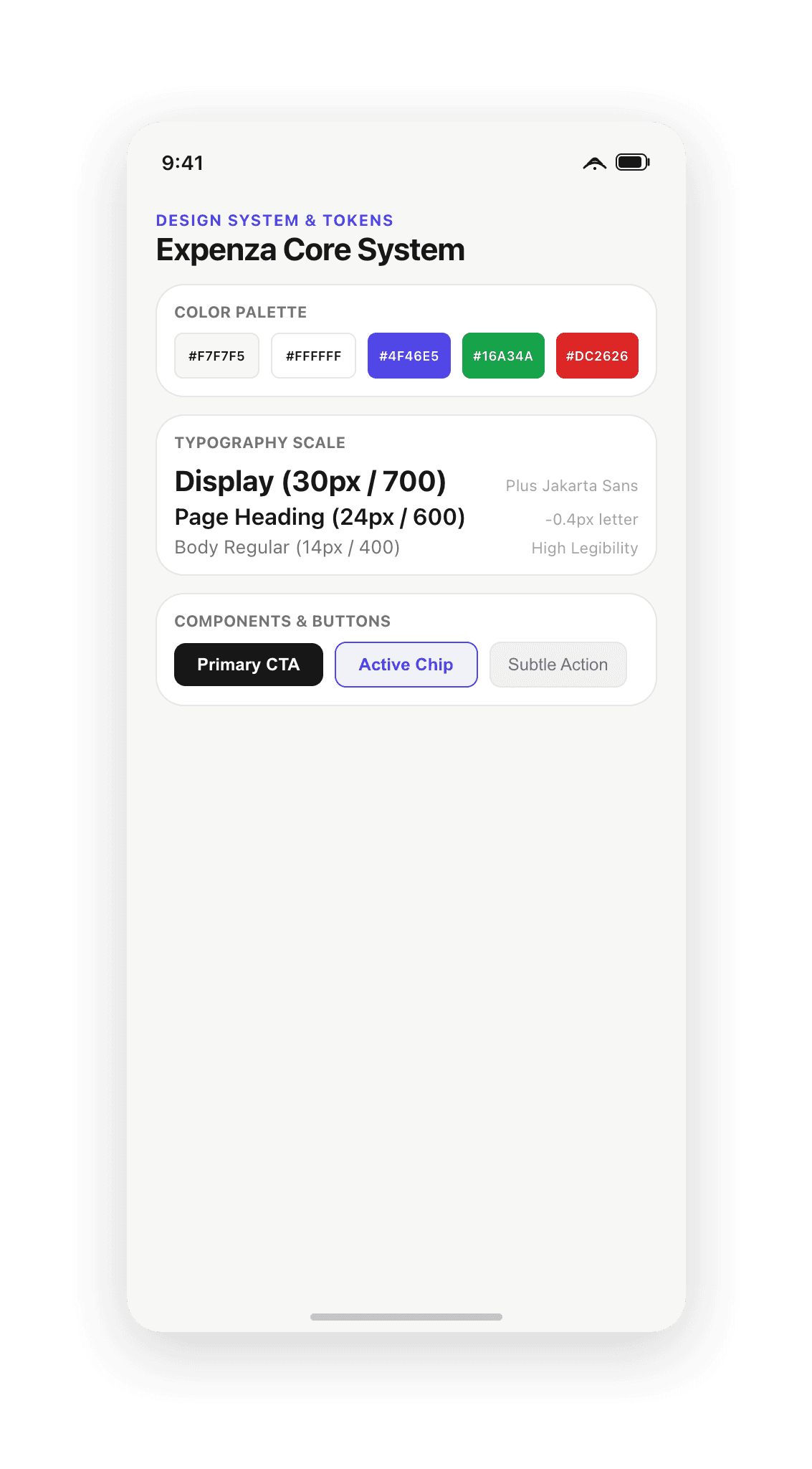
Expenza steps away from dark neon fintech cliches toward an editorial light visual system. Built on warm neutral backgrounds (#F7F7F5), crisp white cards (#FFFFFF), and hairline borders (#E7E7E4), the interface adheres to a strict zero-drop-shadow rule. Tactility comes from precise spacing, border hierarchy, and physical haptics rather than artificial blur layers.
Typography is set in Plus Jakarta Sans for crisp numerical legibility. Category tokens use high-contrast chromatic pairings—warm amber for Food, cobalt blue for Transport, magenta for Shopping, and royal purple for Bills—giving visual weight to distribution without distracting from core totals.
Behavioral reflection: Money Replay & Money Mood
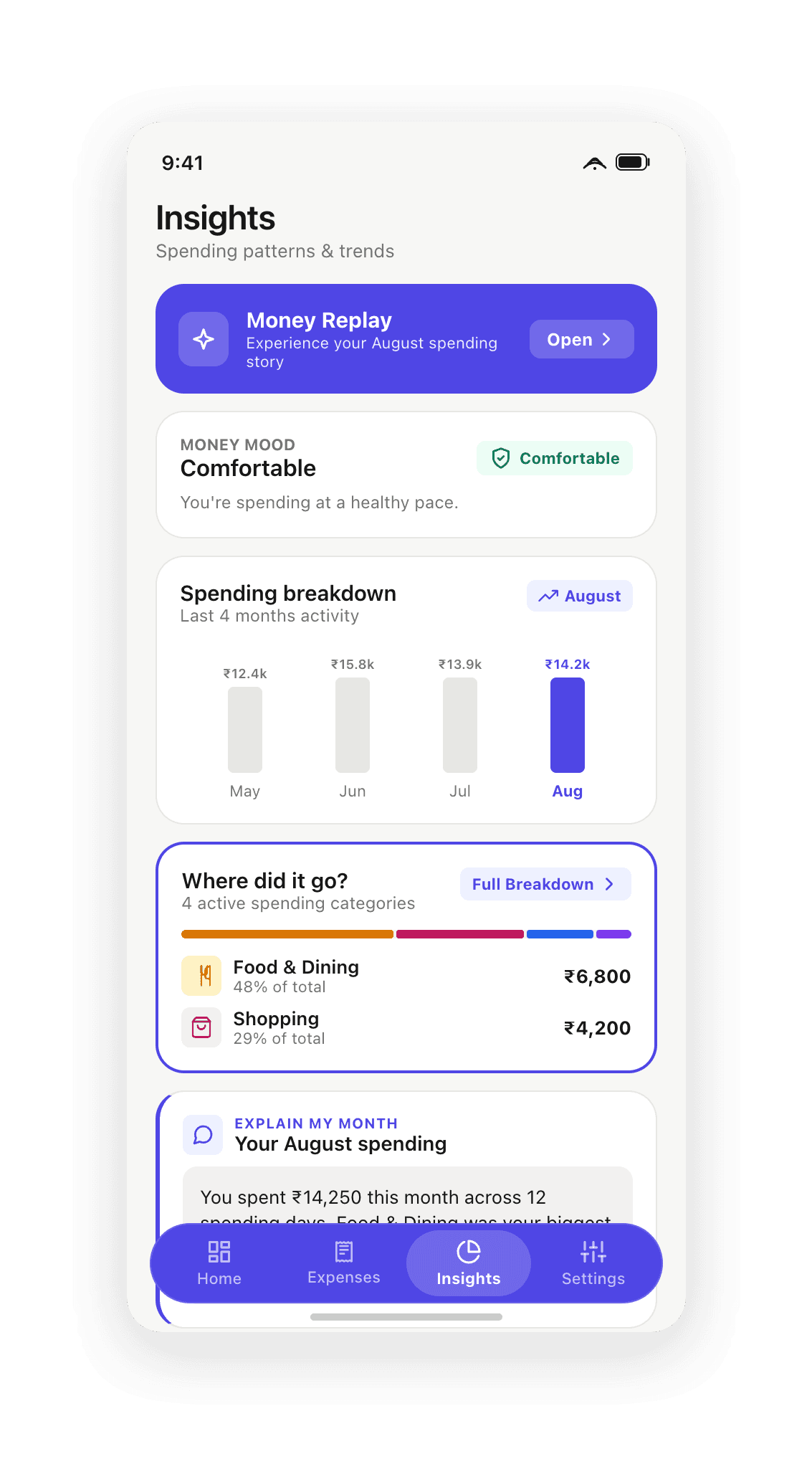
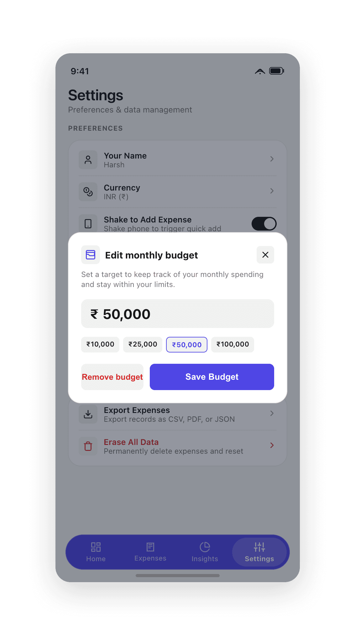
Recording expenses is only half the battle; the interface must also help users understand their spending rhythm. Expenza replaces passive chart dumps with deterministic behavioral insights: the "Money Mood" velocity badge evaluates daily spending speed against the calendar timeline, while consistency streaks reward no-spend and under-budget days.
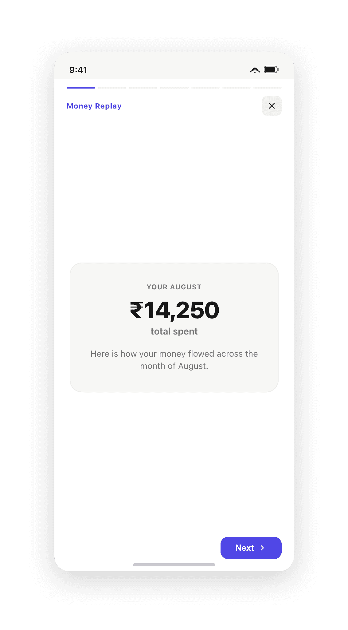
At the end of each month, an interactive 7-stage Money Replay story transforms monthly totals into an engaging visual narrative covering top spending categories, peak spending days, and budget health in plain English.
Local-first sovereignty & native export engine
Privacy is absolute: 100% of financial data is stored on-device via async storage with zero external telemetry, tracking IDs, or required accounts. Users own their data entirely.
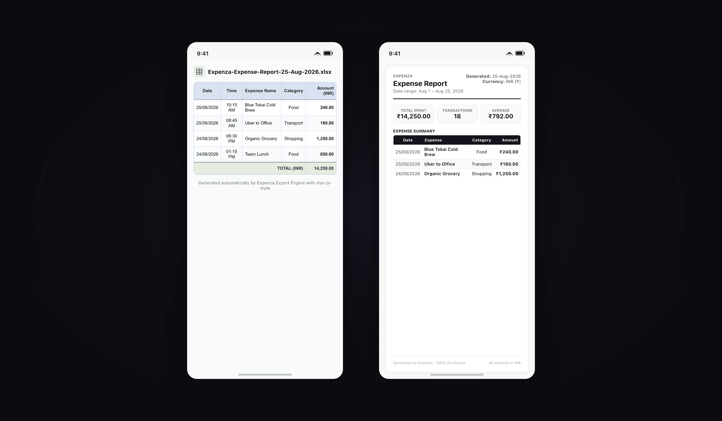
To ensure complete portability, Expenza includes a built-in multi-format export engine. Users can generate professionally styled Excel spreadsheets (.xlsx) with header accents and formulas, formatted A4 PDF financial statements with metric cards, or structured JSON backups for external developer tools.
What it produced
A complete, production-tested mobile personal finance application that reduces everyday capture to a sub-three-second physical gesture while maintaining an editorial light aesthetic and 100% on-device data sovereignty.
What it demonstrates for client engagements is the end-to-end craft: translating physical hardware sensor APIs into delightful micro-interactions, designing rigorous tokenized UI systems that communicate without relying on drop shadows, and delivering pro-tier data exports natively on mobile.
Further reading
- UI/UX design trends for 2026 worth actually adoptingWhich UI/UX design trends for 2026 hold up under real product constraints, from AI-assisted interfaces to accessible-by-default patterns, and which are just decoration.
- How to build a design system in Figma that survives handoffA practical guide to design systems in Figma: variables and tokens, type and spacing scales, component properties, and naming that holds up in code.
- 8 UI Design Mistakes Killing Your Product (and How to Fix Each)The same 8 issues show up in nearly every product I audit — contrast, spacing, hierarchy, states. Here’s the exact fix for each, with tests you can run today.
- Figma to React: a handoff that does not get rebuiltWhy Figma to React handoffs produce code that gets rewritten, and the workflow (token mapping, prop-shaped properties, real states) that prevents it.