The common complaint from developers is not that designs are ugly, or late. It is that the design file answers the wrong questions. A Figma file describes screens; a React codebase describes components with props and states. When the handoff hands over screens, the developer has to reverse-engineer the component model, and their guess will not match yours.
I design and then build the front end myself on most projects, which means I get to feel the cost of my own sloppy handoffs about two days later. Everything below comes out of that loop.
The real gap: screens versus states
A screen is one frozen combination of data, viewport and interaction state. A component has to handle all of them. If the file shows a dashboard with four cards of ideal-length titles, the developer still has to decide what happens with one card, with twelve, with a title that wraps to three lines, while data is loading, and when the request fails.
Those decisions get made anyway. The only question is whether a designer makes them or whether they get invented at 6pm by someone who is also fighting a type error. Every unanswered state is a place where the build drifts from the design, and drift is what makes the rebuild conversation happen.
So the deliverable is not a set of beautiful screens. It is a component inventory plus the screens that show those components composed together.
Shape Figma properties like React props
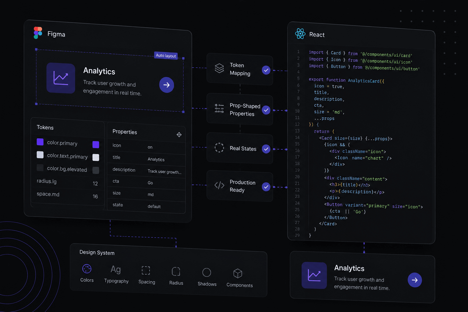
Figma component properties and React props are the same idea with different syntax. A button with variant set to primary or ghost, size set to sm or md, and boolean properties for a leading icon translates directly into a props interface. Name them identically and the mapping is mechanical rather than interpretive.
Avoid variant properties that encode two things at once. A variant called primary-large-icon has to be parsed apart before it can become code, and it multiplies your variant matrix. Three independent properties beat one combined one every time.
The same discipline applies to layer names inside the component. Slot, label, icon and container are useful names. Frame 247 is not. A developer opening Dev Mode reads your layer tree as a rough DOM outline, so a tidy tree is genuinely part of the deliverable.
Where a component nests another component (a card containing a button), use an instance swap or nested instance rather than redrawing it. Nesting in the file is what tells the developer the composition is intentional.
Map tokens to the theme config before the first component
If the project uses Tailwind, the design tokens should land in the theme configuration as named values on day one: colours, spacing, radii, font sizes, shadows. Do that first and the code that follows uses bg-surface-raised and p-4 instead of arbitrary values scattered through the markup.
The friction point is usually the spacing scale. Tailwind's default steps are multiples of 4px; if the Figma spacing tokens use a different base, every gap in the build becomes a bracketed one-off. Align the two scales at the start, or commit to overriding the theme completely. Half-alignment is the worst of both.
Colour tokens should cross the boundary by semantic name, not by hex. When a token changes value later, a semantic mapping means one edit in the theme file. A hex-based handoff means a find-and-replace across a codebase, and it will miss the one in the email template.
Design the states nobody asks for
For every component that displays data, draw the zero, one and many cases. Zero is the empty state and needs copy that says what to do next, not just "No results". One is where centred layouts and grids often break. Many is where you find out whether the list needed pagination.
For every component that fetches, draw loading and error. A skeleton that matches the final layout prevents the shift users feel as jank; a spinner in the middle of a container does not. For errors, write the actual message: "Could not load invoices. Retry" is a design decision, not copy someone fills in later.
For every interactive element, define hover, focus-visible, active and disabled. Focus rings in particular get skipped in design and then either omitted or left as the browser default in code, which is both an accessibility failure and the kind of unpolished detail clients notice without being able to name.
And test the layout with hostile content: a name three times longer than the placeholder, a number with more digits than expected, a language that runs longer than English. Ten minutes of that in Figma saves a bug report per screen.
Specify responsive behaviour, do not imply it
Two frames, one at 1440 and one at 390, leave everything between them to interpretation. Say what happens in the gap: which breakpoints exist, what the container max width is, which grids collapse from four columns to two to one, and what the padding is at each step.
Auto layout with wrapping and fill-container resizing communicates a lot of this without extra frames, because it demonstrates intent rather than describing it. Where the behaviour is genuinely non-obvious (a sidebar that becomes a bottom sheet, a table that becomes stacked cards), draw the intermediate state. That is the one the developer would otherwise have to invent.
What the design-to-code plugins still cannot do
Plugins that export Figma frames to React have improved a lot, and they are genuinely useful for a static marketing section or a quick prototype. What they cannot do is produce a component that fits the codebase you already have. The output does not know about your existing Button, your theme tokens, your routing, your data layer or your state management, so it arrives as a self-contained island of markup that has to be dismantled before it can be used.
They also cannot infer props or states, because those do not exist in the frame, which is precisely the gap described at the top of this article. The generated code represents one screen, one breakpoint, one state.
The realistic use is scaffolding: let a plugin get the structure and spacing roughly in place, then rewrite it against the real design system. Treat the output as a first draft written by someone who has never seen the rest of the project, and the tool becomes helpful rather than a source of technical debt.