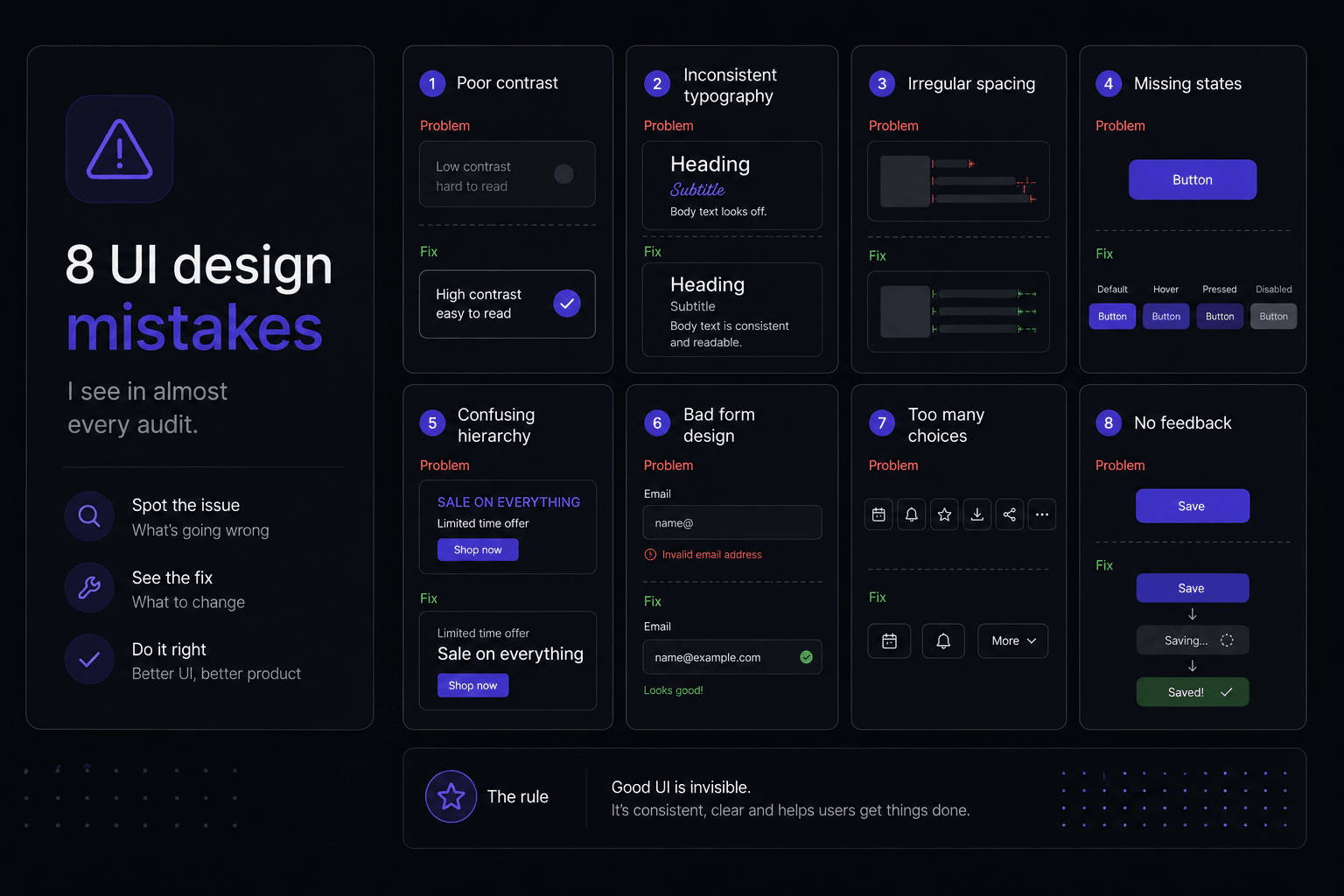
When a founder asks me to look at their existing product, the problems are rarely exotic. The same eight issues account for most of what makes an interface feel unfinished, and all of them are cheap to fix relative to how much they change the impression the product makes.
None of this is about taste. Each item below has a concrete test you can run on your own screens this afternoon.
Too many type sizes, too little hierarchy
Count the distinct font sizes in your product. If the number is above eight, some of them are doing no work. The usual pattern is sizes that differ by a single pixel (15 and 16, 13 and 14), which reads as inconsistency rather than hierarchy, because the eye cannot resolve the difference but does register that something is off.
The fix is a fixed ramp with obvious jumps between steps, and using weight and colour to create the finer distinctions instead of size. A muted grey label at the same size as the body text separates itself perfectly well without a new size in the scale.
The related mistake is heading levels chosen by appearance. Pick the heading level for document structure and style it to look right; screen readers and search engines both read the structure, not the pixel size.
Spacing that is even instead of grouped
Interfaces that feel hard to scan are usually spaced uniformly: the same 16px gap between a label and its input as between two unrelated sections. Proximity is the strongest grouping signal there is, and using it evenly throws it away.
Fix it by deciding relationships first. A label sits close to its field, fields sit further apart from each other, and a section break gets two or three times that. When the spacing is right you can squint at the screen and still see the structure.
While you are there, pick a base unit (4px is a good default) and stop using values outside the scale. Arbitrary spacing is the single most common source of the "something looks slightly wrong" feeling that clients report but cannot diagnose.
Contrast that fails on real screens
Light grey text on a white background looks refined on a designer's calibrated monitor in a dim room. It is unreadable on a laptop outdoors, and it fails accessibility requirements. The threshold to check against is a 4.5:1 contrast ratio for body text and 3:1 for large text, icons and the borders of interactive controls.
Run a contrast checker over your muted text, your placeholder text, your disabled states and your borders. Placeholder text is the most common failure, and it is often carrying information that should have been a label anyway.
The second half of this is not relying on colour alone. A red border on an invalid field means nothing to a colour-blind user without an icon and a message. Errors need text, always.
Empty, loading and error states left undesigned
The first screen a new user sees is usually the empty one, and it is usually the least designed screen in the product. An empty state that says "No projects yet" wastes the moment; one that explains what a project is and offers the button to create the first one is onboarding.
Loading states deserve the same attention. A skeleton shaped like the content that is coming reduces the perceived wait and prevents the layout jumping when data arrives. A centred spinner does neither.
For errors, write messages that name the problem and the next action. "Something went wrong" tells the user only that you did not think about this case.
Forms that fight the person filling them in
Placeholders used as labels disappear the moment someone types, so anyone who gets interrupted has to clear the field to remember what it wanted. Use a persistent label above the field and keep the placeholder for format examples, if at all.
Validate on blur rather than on every keystroke, so the user is not told their email is invalid while they are still typing the third character. Put the error message directly under the field, in text, and say how to fix it.
Cut the fields. Every optional field is a small tax on completion, and most forms have at least two that exist because someone once thought the data might be useful. Four fields is a good target for a contact form.
Touch targets and desktop-first thinking
Icon-only buttons designed at 24px on a desktop mock become 24px tap targets on a phone. The practical minimum is around 44px of touch area, which you can achieve with padding without changing the visual size of the icon.
Check the spacing between adjacent targets too: a row of icons 4px apart produces mis-taps regardless of individual size. And put primary actions within thumb reach on mobile rather than pinned to a top-right corner inherited from the desktop layout.
Designing with content that will never exist
Lorem ipsum has a convenient, uniform word length. Real product data does not. Layouts built on placeholder text break on the customer whose company name is forty characters long, the invoice total with two extra digits, and the notification that arrives with no body text at all.
Use realistic content from the start, then stress test it: the longest plausible string, the shortest, the empty case. If the design only holds at the ideal length, it is a picture of an interface rather than an interface.
No visible focus and no keyboard path
Custom components frequently ship with the browser focus ring removed and nothing put in its place, which makes the product unusable by keyboard and invisible to anyone navigating without a mouse. Design a focus style that matches the visual language instead of deleting the default.
Then tab through a key flow yourself. You will find the modal that does not trap focus, the dropdown that cannot be opened without a click, and the order in which elements receive focus jumping around the screen. These are twenty-minute fixes at design time and rewrites after launch.