Zenith
A task management app concept designed in full light and dark themes from one token set, with progress, priority and status readable at a glance without colour doing all the work.
- Type
- Concept project, self-initiated
- Role
- UX, UI and design system
- Platform
- iOS and Android
- Tools
- Figma
The problem with task apps
Most task managers show you everything you have not done. Open one on a bad week and the first thing it communicates is failure: a wall of overdue items with no sense of what is actually moving.
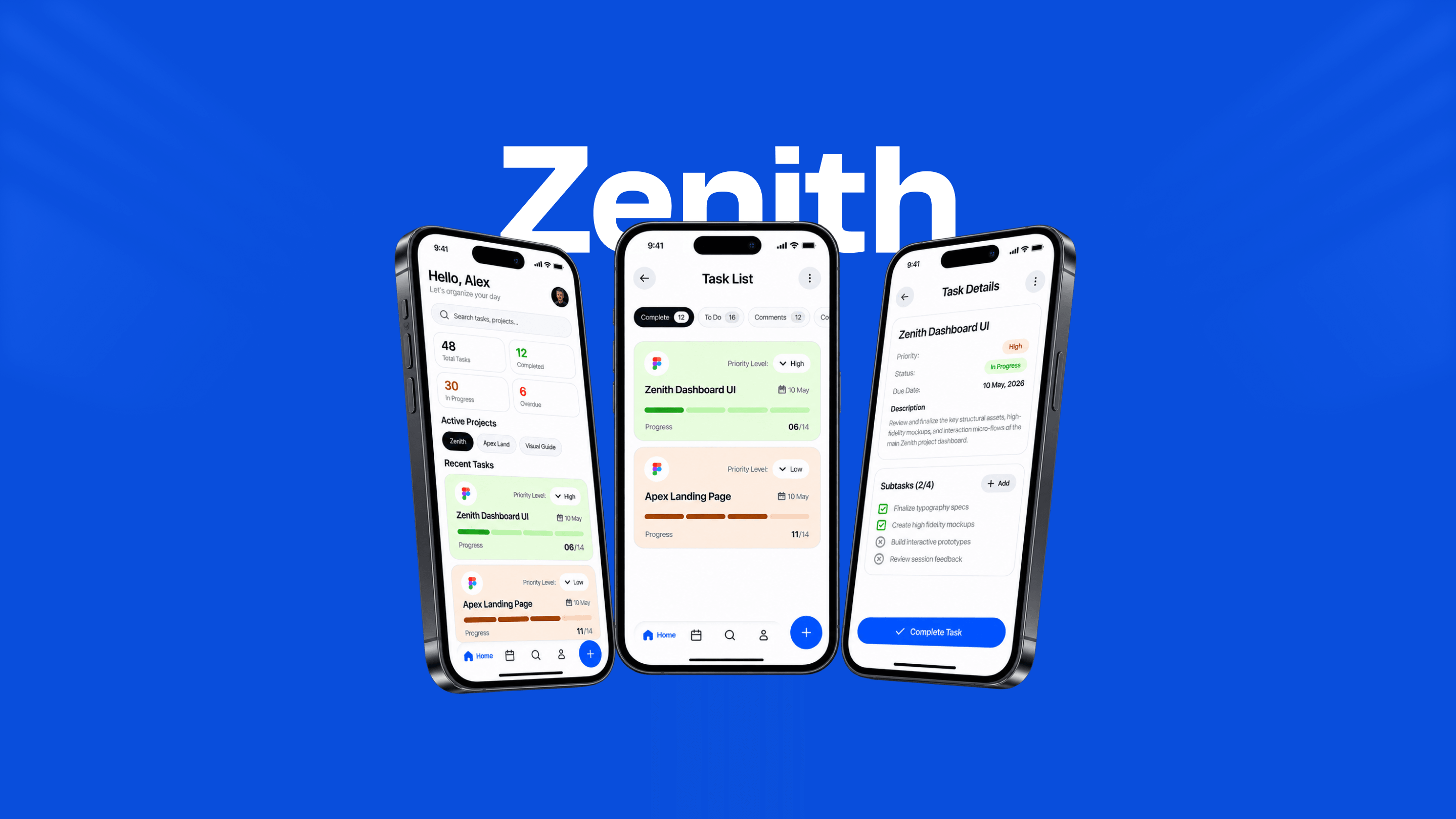
Zenith starts from the opposite position. The dashboard opens on four counts (total, completed, in progress, overdue), so the state of the week is one glance rather than a scroll, and "completed" carries the same visual weight as "overdue" instead of being buried under it.
Progress you can read without reading
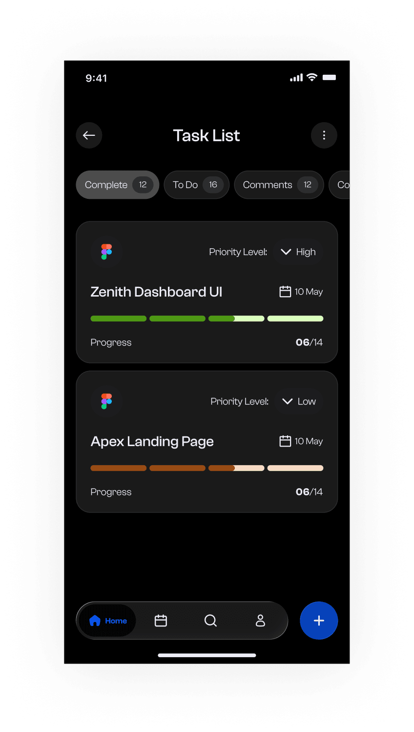
Every task card carries a segmented progress bar and a count like 06/14. The segments matter: a continuous bar at 43% is a number you have to interpret, while four filled blocks out of nine is a shape you recognise before you have read anything.
Priority is a labelled dropdown rather than a colour alone. Colour still reinforces it, but the word "High" carries the meaning: a red dot is invisible to a red-green colourblind user and ambiguous to everyone else.
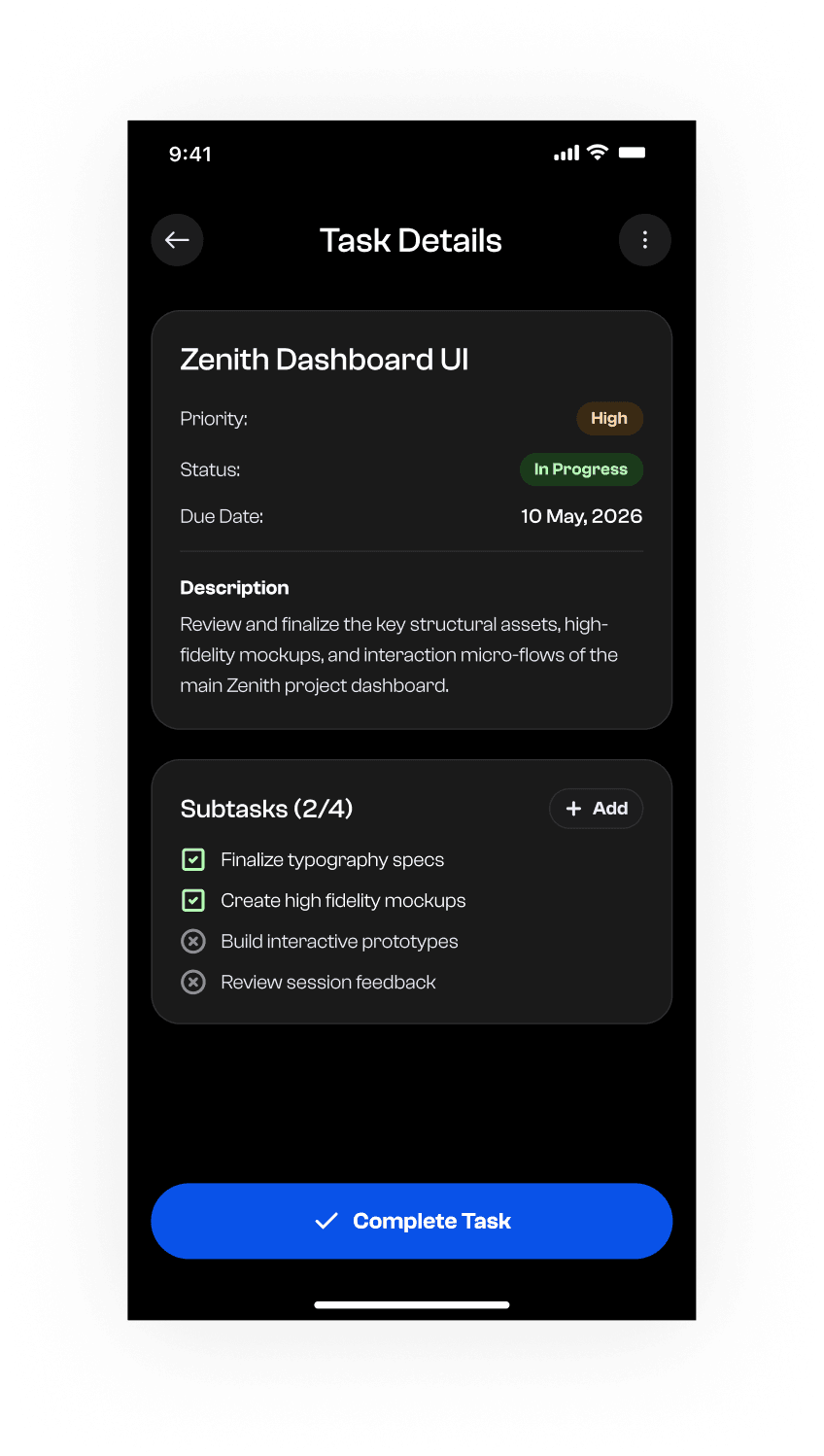
The task detail screen extends the same idea. Priority, status and due date are stacked as labelled rows, and subtasks are a checklist with a visible 2/4 count, so the next action is always a specific thing rather than a general obligation.
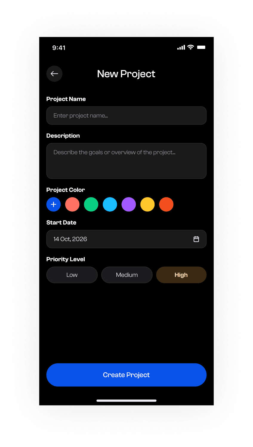
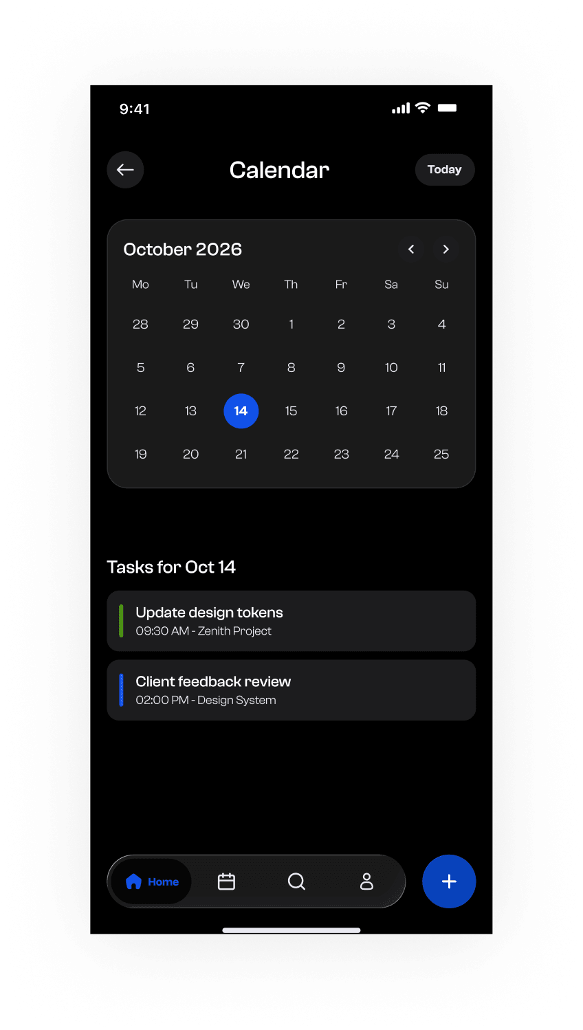
Two themes, one token set
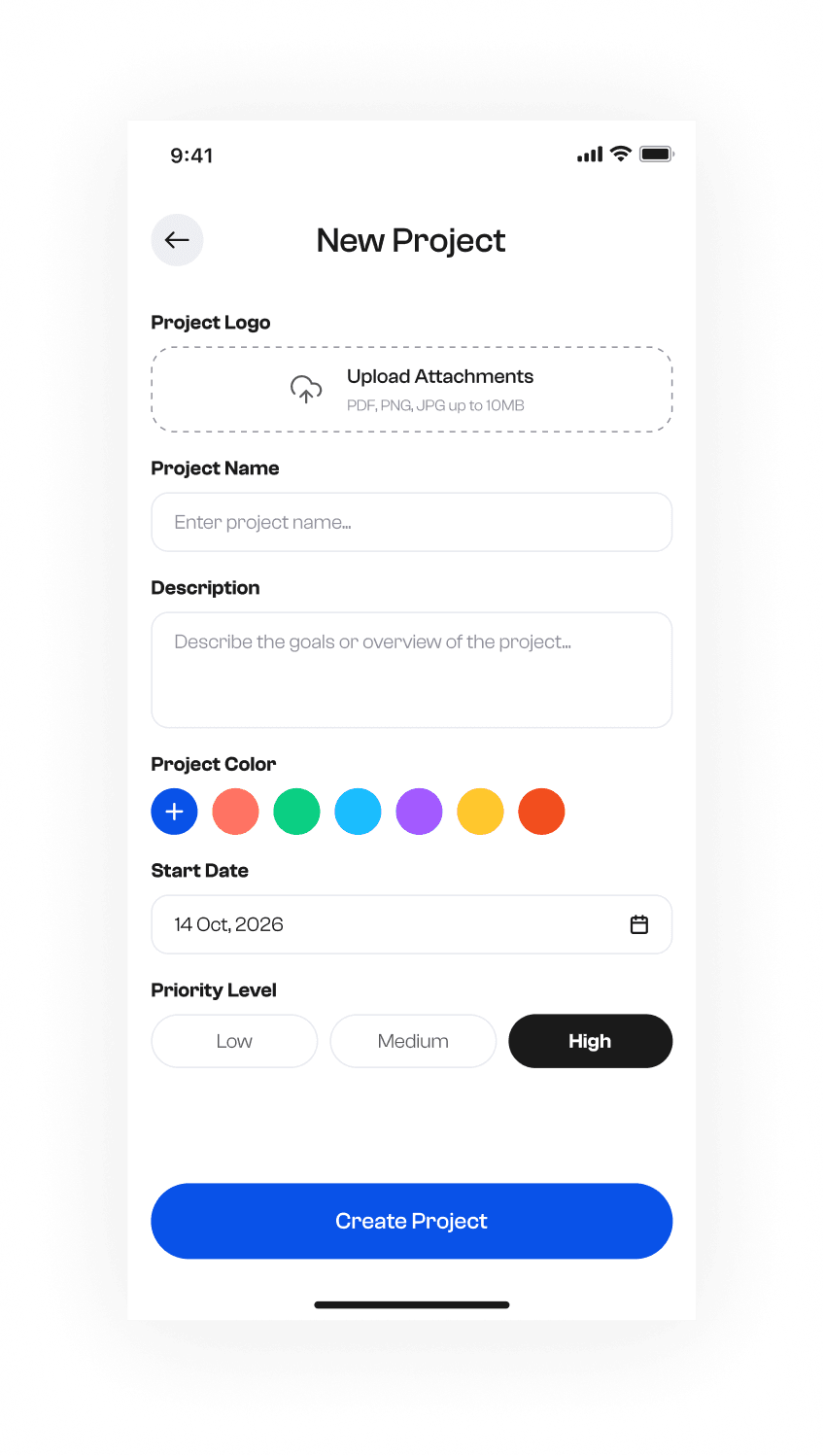
Light and dark are both designed here, not one designed and the other inverted. Every screen exists in both, which is the only way to find the places an inverted palette breaks: the pale progress fill that vanishes on white, the card surface that stops separating from the background once both are dark.
Both themes read from one set of colour, type and spacing tokens, so a change to the scale moves both at once. That is the difference between shipping a dark mode and maintaining one.
It also kept the screen count honest. Designing search, notifications, calendar, profile and task creation twice is only sustainable if the components are shared, which turns out to be a useful limit on how many one-off components a design is allowed.
The screens nobody demos
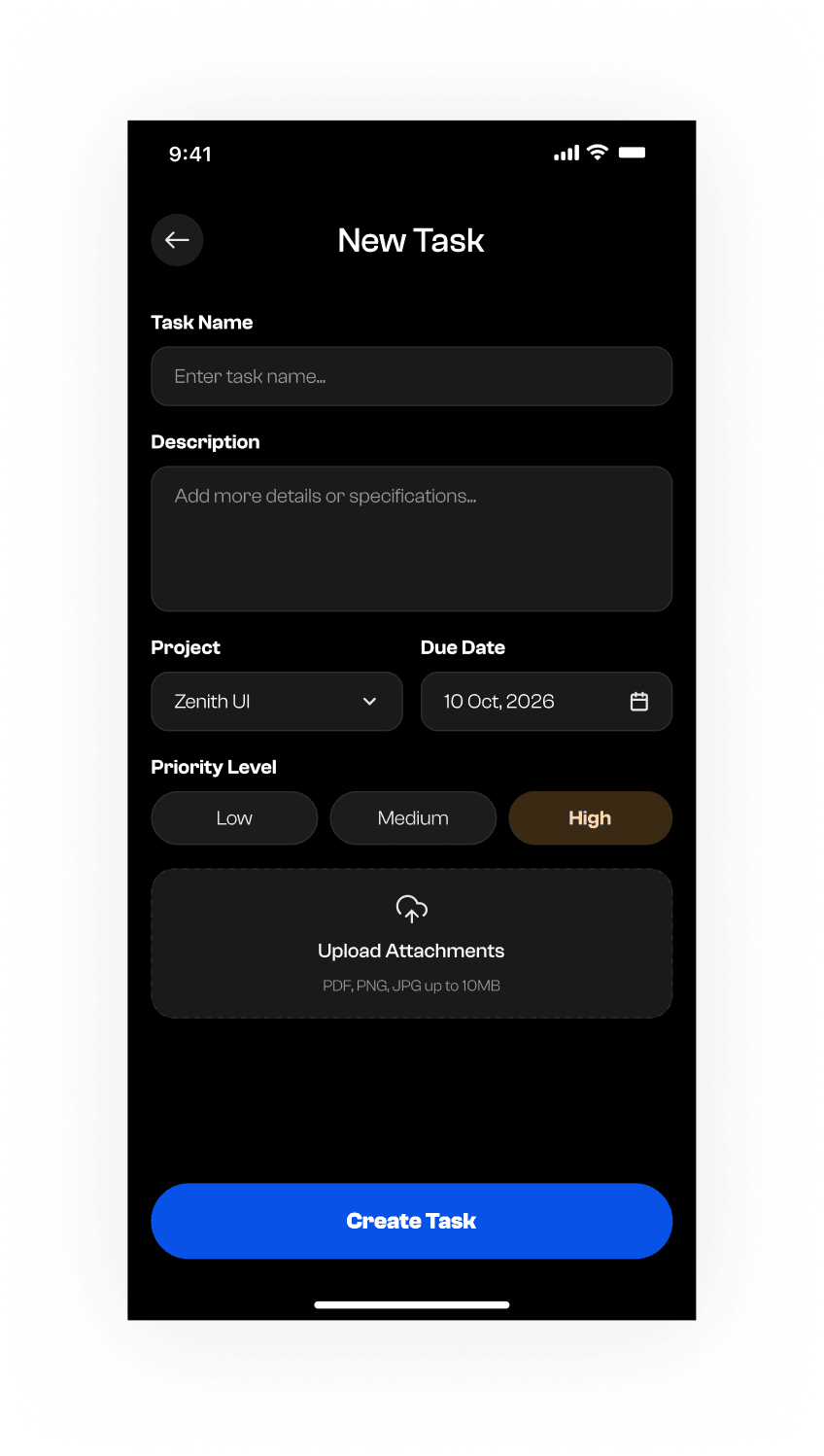
Beyond the three hero screens, the concept covers creating a task and a project, the calendar view, search in both themes, notifications and profile settings. These are the screens a walkthrough skips and a real user lives in.
Designing them is also what tests the system. A component library looks complete until you try to lay out a settings page with it, which is usually where the gaps in a token set surface.
What it produced
A complete two-theme screen set (dashboard, task list, task detail, task and project creation, calendar, search, notifications and settings), built on a shared token set rather than assembled screen by screen.
As a concept it has no usage data behind it, and this page does not pretend otherwise. What it demonstrates is the part that transfers to client work: designing both themes at once, keeping status legible without relying on colour, and covering the screens that only matter once a product is actually in use.
Further reading
- How to build a design system in Figma that survives handoffA practical guide to design systems in Figma: variables and tokens, type and spacing scales, component properties, and naming that holds up in code.
- 8 UI Design Mistakes Killing Your Product (and How to Fix Each)The same 8 issues show up in nearly every product I audit — contrast, spacing, hierarchy, states. Here’s the exact fix for each, with tests you can run today.
- UI/UX design trends for 2026 worth actually adoptingWhich UI/UX design trends for 2026 hold up under real product constraints, from AI-assisted interfaces to accessible-by-default patterns, and which are just decoration.