Crave
A dark-mode food delivery app concept where the interface gets out of the way of the food: one saturated accent on near-black, photography as the light source, and a home screen ordered by how undecided you are.
- Type
- Concept project, self-initiated
- Role
- UX, UI and prototype
- Platform
- iOS and Android
- Tools
- Figma
Designing for appetite
Food ordering is not an efficiency problem. Nobody opens a delivery app knowing exactly what they want and resenting the taps in between. They open it hungry and undecided, and the job of the interface is to help them want something.
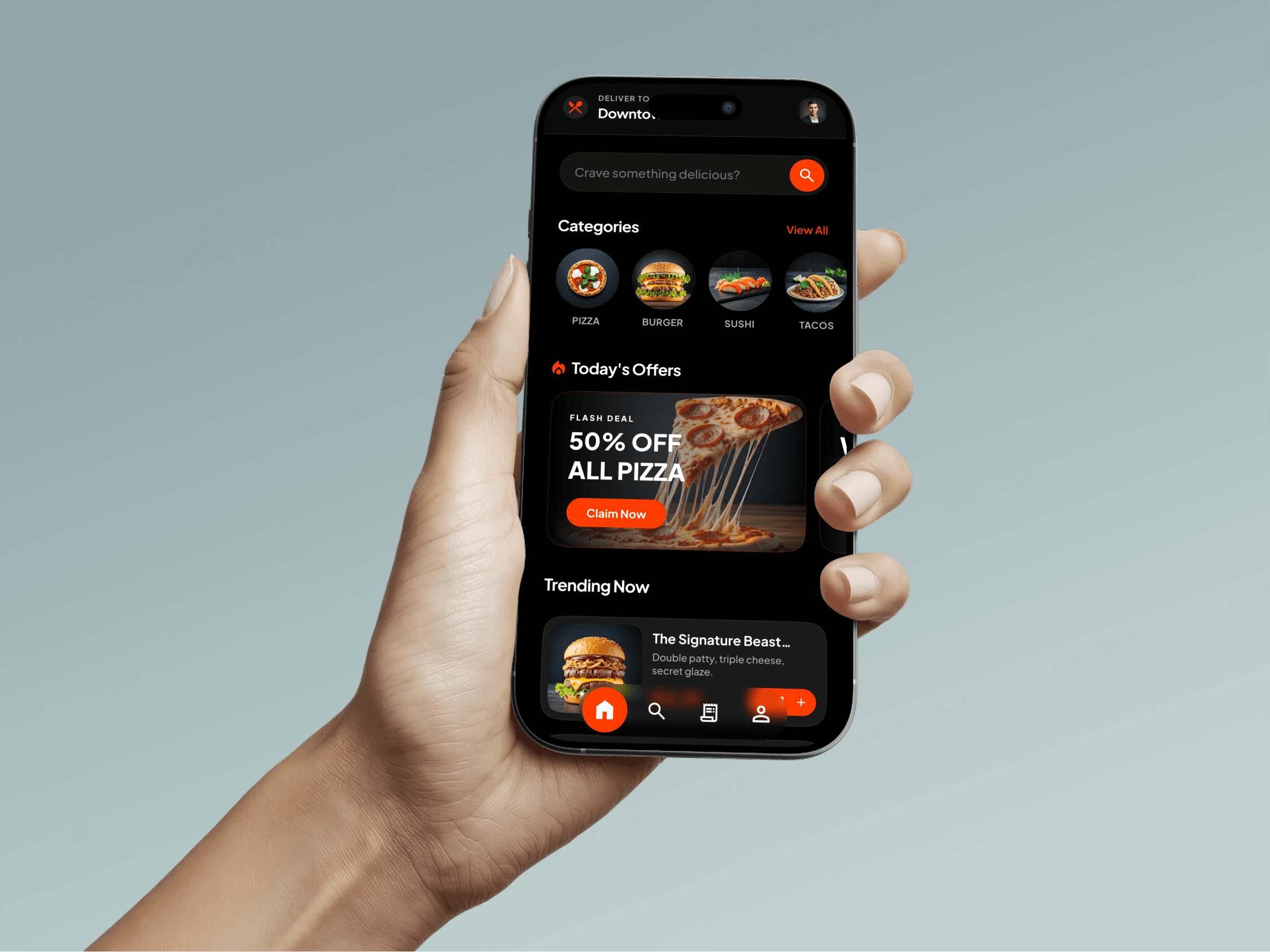
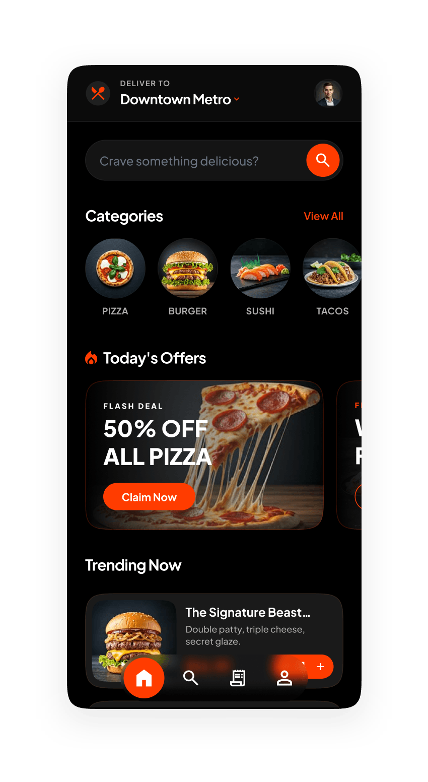
That is the argument for the dark theme. On a near-black surface the photography becomes the only light in the frame, and a cheese pull or a burger cross-section carries the screen instead of competing with a white background for attention.
A single saturated orange does everything else: search, the active tab, the offer badge, the delivery time, the add button. One accent used consistently means every orange thing on screen is something you can act on.
A home screen that answers "what do I want?"
The home screen is ordered by how undecided you are. Categories come first as circular photographs (pizza, burger, sushi, tacos) for the person who knows the shape of what they want but not the restaurant.
Today’s Offers sits next as a horizontally scrolling carousel of flash deals, because price is what settles a large share of orders and burying it under a menu is pretending otherwise. Trending Now closes the screen for anyone still browsing.
The delivery address stays pinned to the top as a dropdown. It is the one piece of state that invalidates everything below it, so it should never take a trip into settings to check.
Browsing without losing the thread
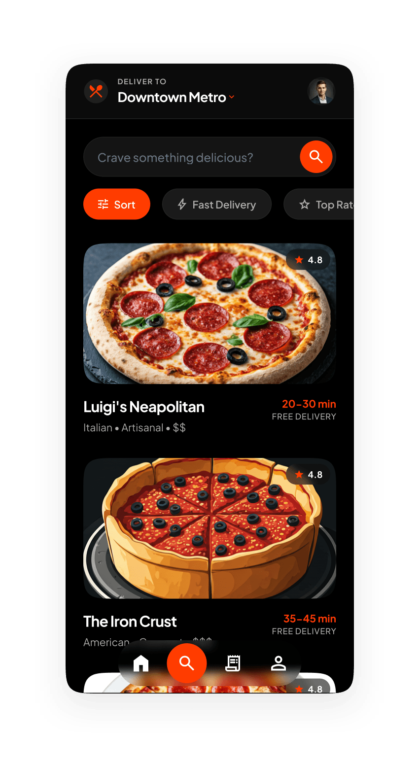
The restaurant list keeps the search field in place and puts sort, fast delivery and top rated in a filter row directly beneath it, so narrowing a list never means leaving it and coming back.
Each card carries the things that actually decide an order: a photograph, a rating, cuisine and price tags, a delivery window and a free-delivery flag. The rating sits on the image rather than under the name, so it stays readable while scrolling at speed.
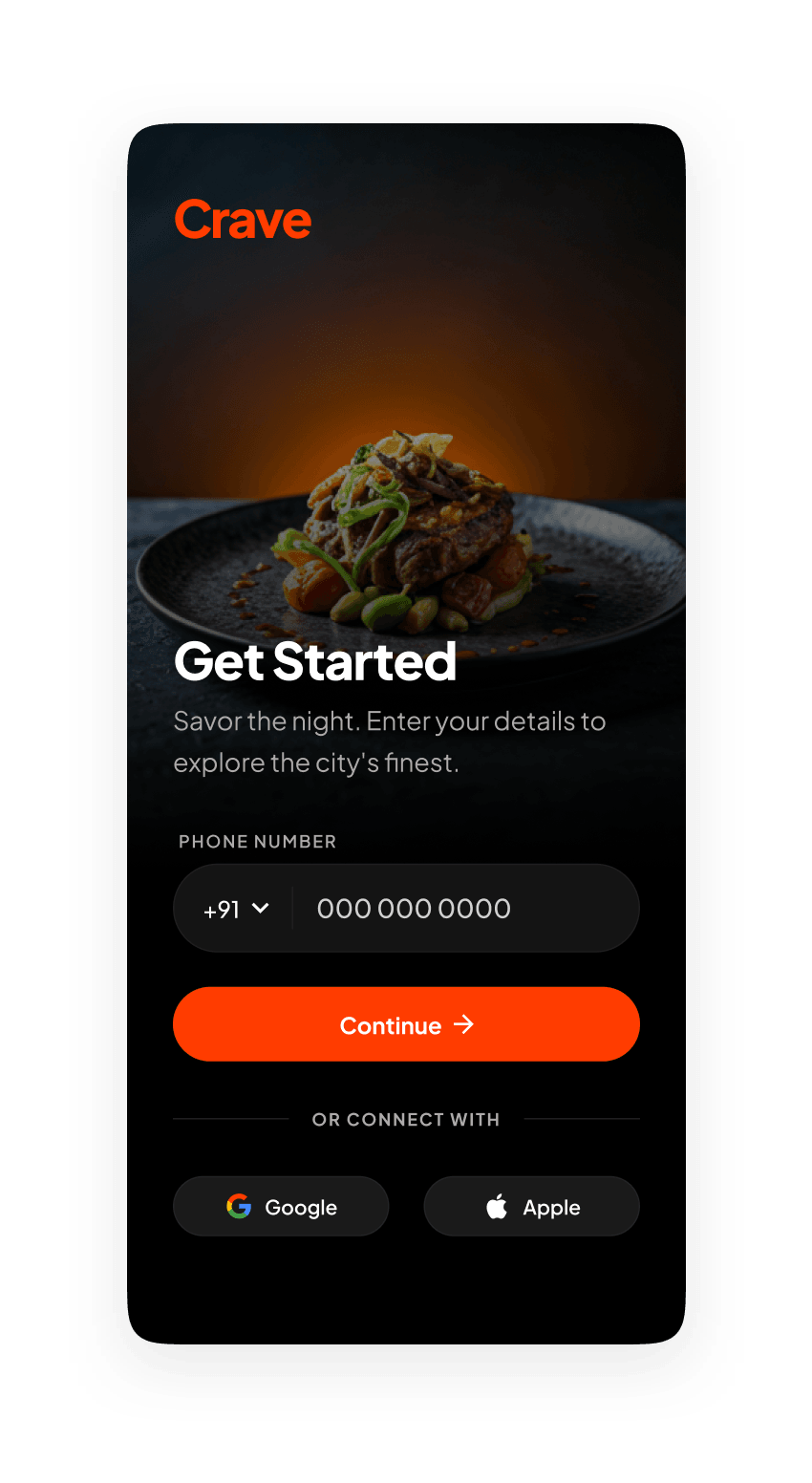
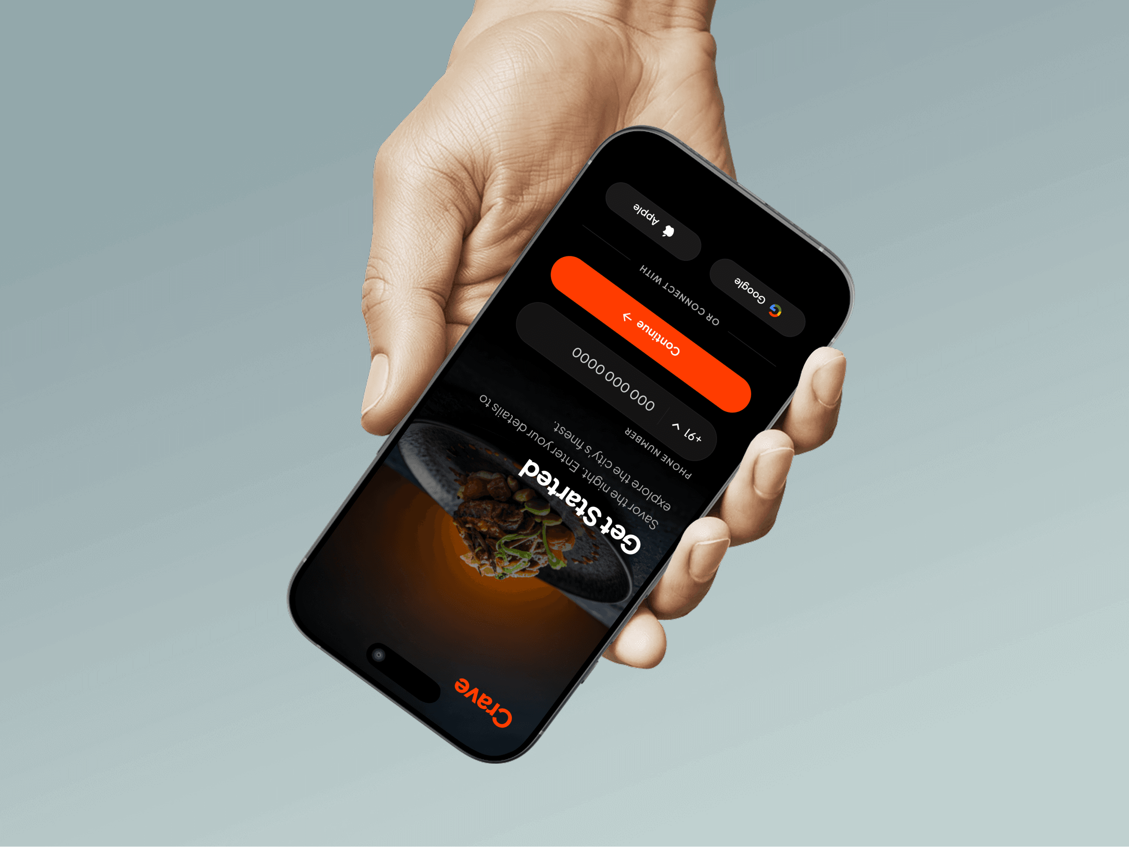
Sign-up is deliberately late and deliberately plain: same dark surface, one clear action. An account wall in front of a menu is the fastest way to lose someone who was only browsing.
What it produced
A dark-theme screen set covering sign-up, home, category browsing and restaurant listing, with one accent colour carrying every interactive element and photography treated as the primary visual material rather than as decoration.
It is a concept, so there is no order volume to report. The transferable part is the reasoning: choosing a theme because of what the content is, spending the accent colour on a single job, and ordering a home screen around how decided the user already is.