StayEase
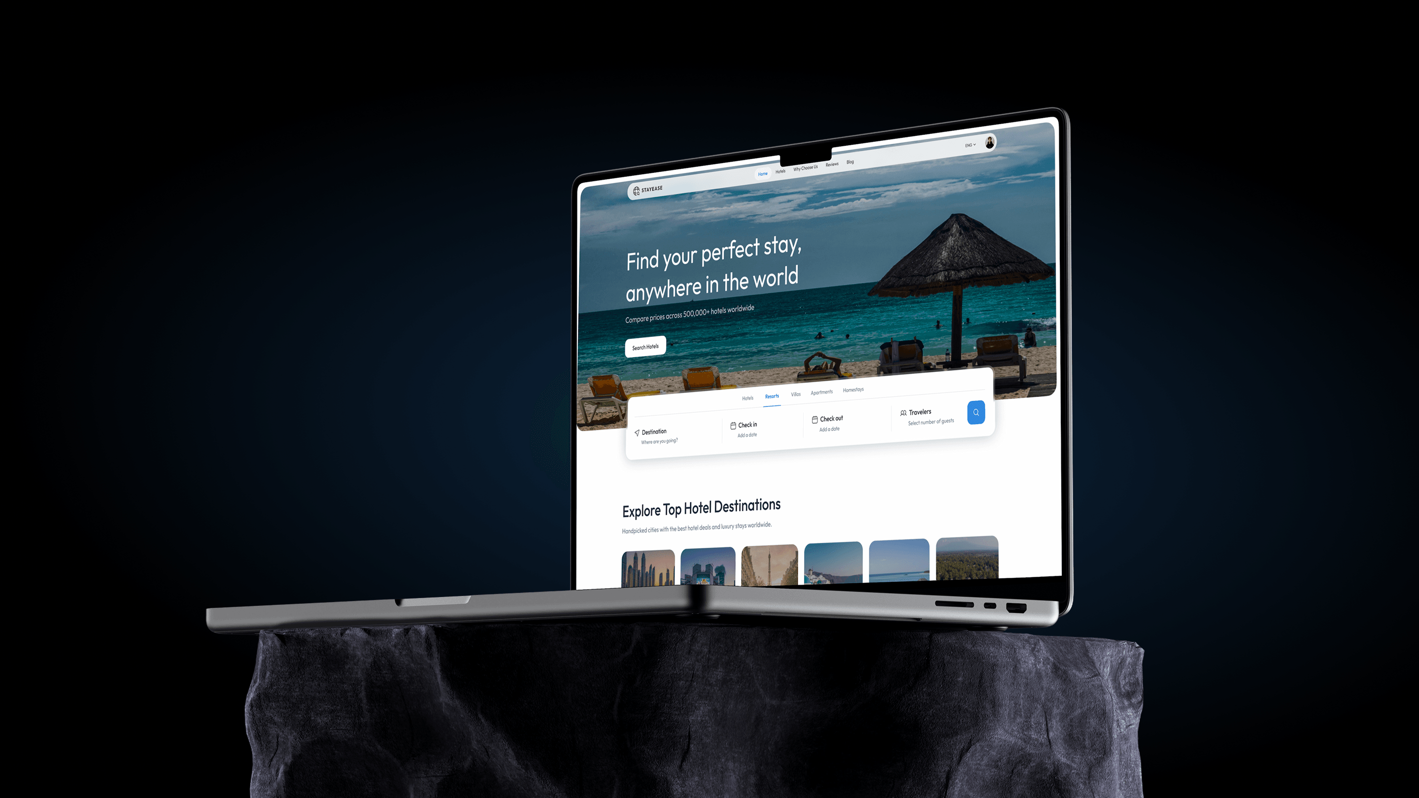
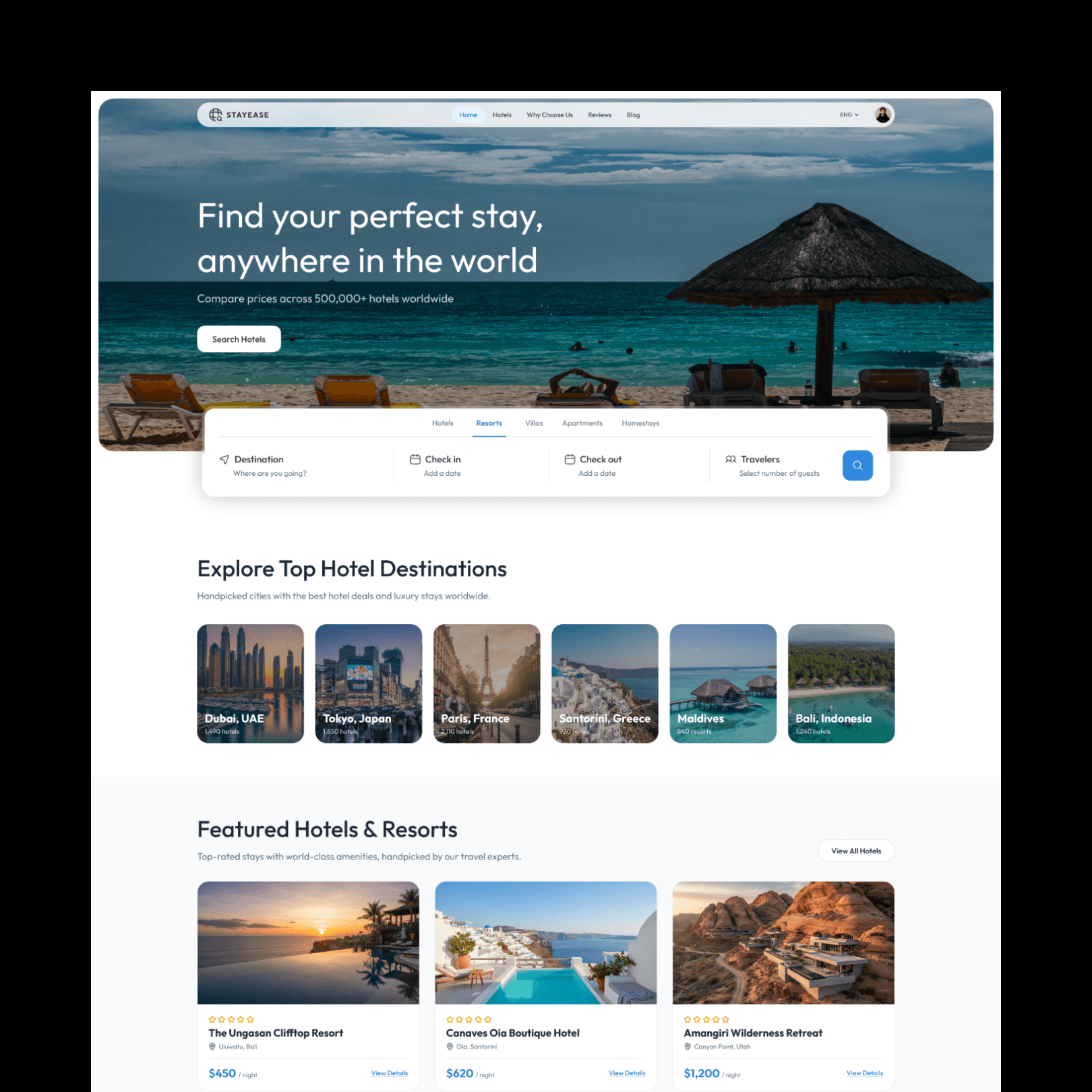
A hotel booking website concept built around its search bar: a five-way stay-type switch, four fields that hold their state, and destination browsing for travellers who have not picked a city yet.
- Type
- Concept project, self-initiated
- Role
- UX, UI and visual identity
- Platform
- Responsive web
- Tools
- Figma
The search bar is the product
On a booking site everything above the fold is scenery except one component. The search bar is where the session actually begins, so it was designed first and the rest of the page arranged around it.
It deliberately overlaps the hero image rather than sitting below it, because that puts the most important control at the optical centre of the page instead of at the bottom of a decorative band.
The four fields stay labelled and permanently visible: destination, check in, check out, travellers. Collapsing them into a single "Search" input looks tidier in a mockup and immediately costs the visitor the ability to see what they have already filled in.
Stay type before destination
A row of tabs above the fields (hotels, resorts, villas, apartments, homestays) sets the kind of stay before anything else. That ordering matters: someone looking for a villa and someone looking for a homestay are running different searches, and filtering after the results arrive means discarding a page of listings they never wanted.
The tabs are a switch rather than another filter chip for the same reason. This is one choice that reframes the whole query, not one of several refinements stacked together.
For travellers without a destination
A search bar assumes you know where you are going. Plenty of trips do not start that way, which is why "Explore Top Hotel Destinations" sits directly beneath it as a row of city cards.
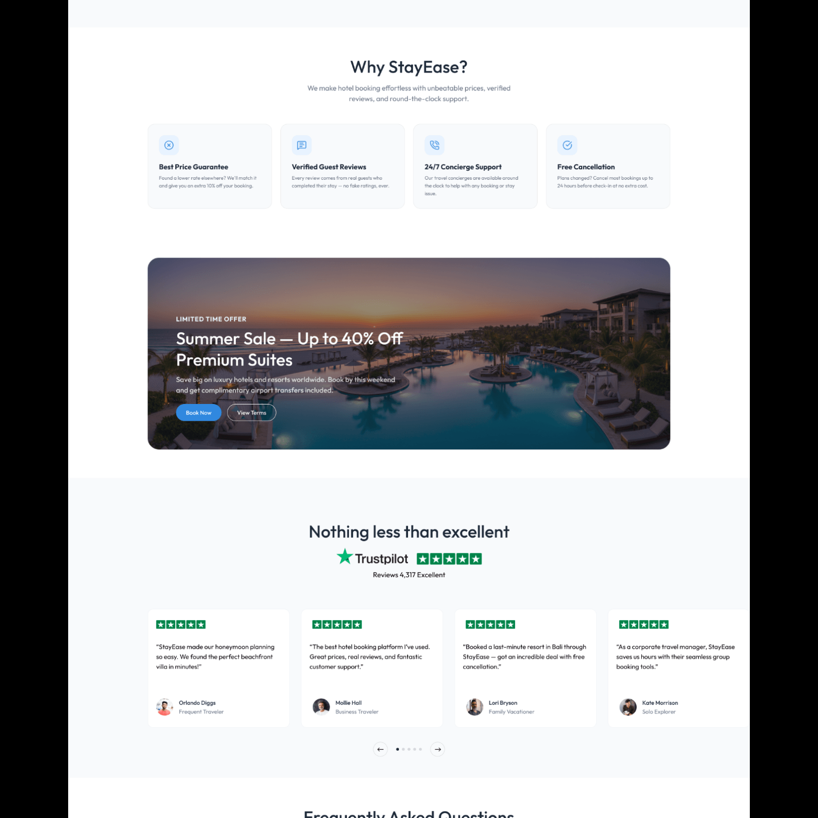
It is the same argument as the food app: give the undecided visitor a way in that does not require them to type. The rest of the page then follows the order a browsing visitor asks questions in: what is on offer, why this site, what other people said.
What it produced
A homepage concept with a working information hierarchy: stay type, then the four search fields, then destination browsing for anyone who has not decided, followed by the supporting sections a booking visitor reads in that order.
No bookings were taken and none are claimed. What the project demonstrates is designing a page around its one load-bearing component rather than around a hero image, and giving the undecided visitor a route in that does not start with an empty text field.
Further reading
- Figma to React: a handoff that does not get rebuiltWhy Figma to React handoffs produce code that gets rewritten, and the workflow (token mapping, prop-shaped properties, real states) that prevents it.
- 8 UI Design Mistakes Killing Your Product (and How to Fix Each)The same 8 issues show up in nearly every product I audit — contrast, spacing, hierarchy, states. Here’s the exact fix for each, with tests you can run today.
- AI coding tools in 2026: what changes on a client buildWhere AI coding assistants genuinely speed up client front-end work in 2026, where they quietly cost time instead, and how code review has to change either way.