Every January a list goes around with the same shape: fifteen trends, a screenshot from Dribbble for each, and no mention of what happens when the trend meets a real content management system, a support ticket queue, or a user on a three-year-old Android phone. Most of it does not survive contact with a shipping product.
I audit and redesign live products for a living, not concept shots, so this is the shorter list: the shifts in UI/UX design that are actually showing up in briefs and holding up in usability testing this year, and the ones I would still tell a client to skip.
Judge a trend by what it costs the user, not how it photographs
A trend earns a place in a real interface if it removes a step, clarifies a state, or speeds up a task. Everything else is decoration wearing the vocabulary of a design system, and decoration has a cost: every animated flourish is milliseconds of blocked main thread, every novel pattern is a moment a first-time user has to stop and learn your product instead of using it.
The filter I actually use on client work: would this still be worth building if nobody could see it was "on trend"? If the honest answer is that it exists to look current in a portfolio shot, it does not go in the file.
That filter is why the list below skips most of what circulates as this year’s UI trends and keeps only what changed how a product behaves, not just how it looks.
AI inside the interface, not just behind it
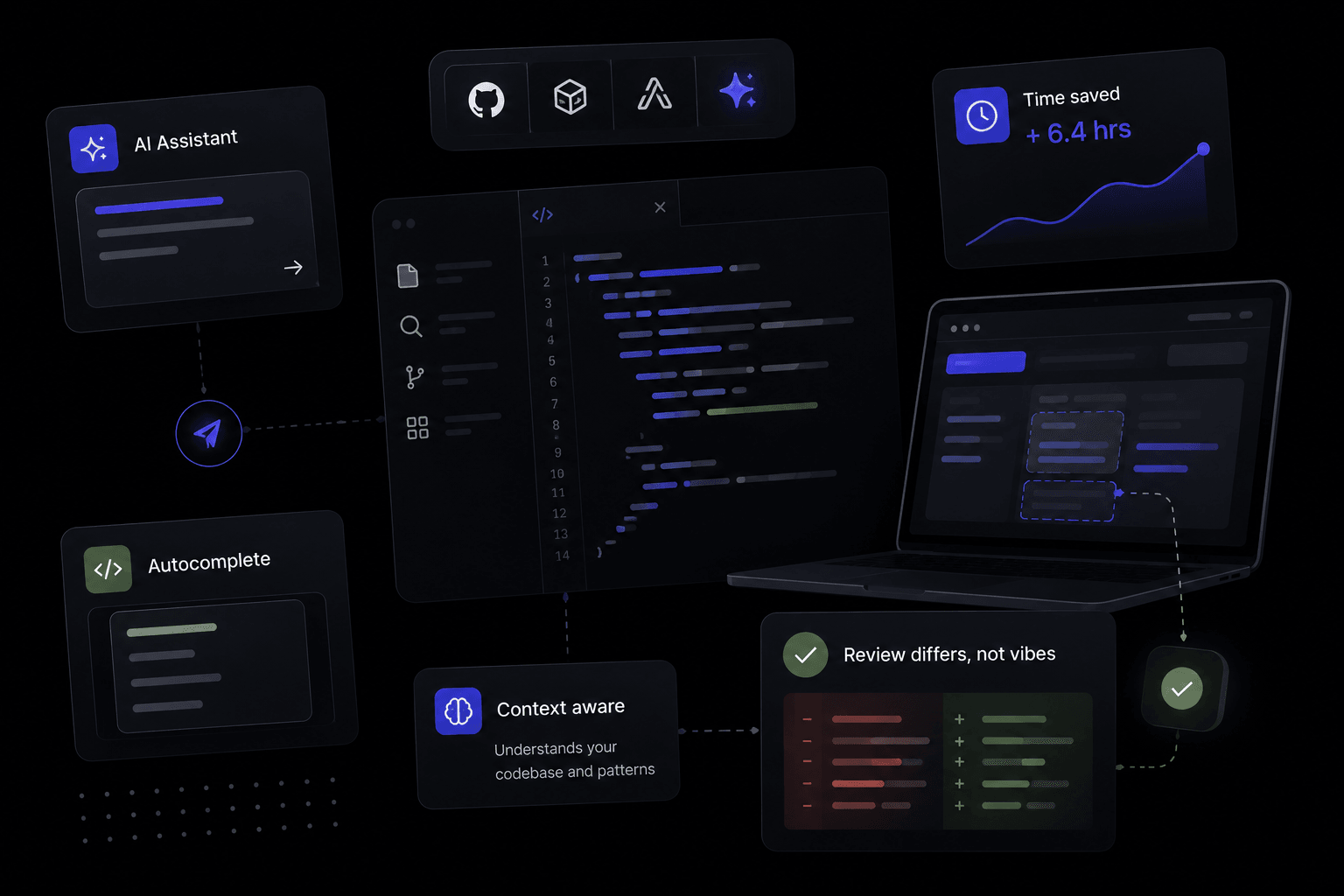
The interesting shift this year is not that products added a chatbot. It is AI surfacing inside existing flows: inline suggestions in a form field, a generated first draft in an empty state, a summary offered instead of forcing someone to read forty rows of a table. Done well it removes a step; done badly it is a spinner with extra confidence.
The design problem is trust, not novelty. An AI-filled field needs to look editable and provisional, not final. I use a visibly different state for it, a distinct background tint plus a label, until the user has explicitly accepted it. Ship a generated value that looks identical to a user-entered one and the first wrong guess erodes trust in every field after it.
Latency also needs designing for, not apologised for after the fact. If a suggestion takes two seconds to arrive, the empty state before it has to hold its own, not sit there as a blank box implying something is broken.
Motion with restraint, not motion by default
Two years of every card animating in and every button carrying a spring on hover have produced the correction: motion that communicates a state change, and nothing else. A save button confirming with a checkmark morph is worth the frames it costs. A page of cards staggering in on every visit is not; it is a tax the user pays each time they arrive, for no information gained.
`prefers-reduced-motion` moved from a nice-to-have to a default check on client work this year, and rightly so. It is no longer just an accessibility line item — browsers ship it on by default for a meaningful share of users, and a product that ignores the query is choosing to fight the operating system.
The practical rule: animate to explain a change in state (loading, success, error, an item leaving a list), and leave everything else static. If you cannot say what a given animation is teaching the user, cut it.
Accessible-by-default is no longer a separate pass
Contrast ratios, visible focus states and keyboard paths used to be the thing checked at the end, if there was time. In 2026 briefs I am seeing them named up front, partly because WCAG 2.2 has become the baseline expectation in more procurement checklists, and partly because more of the audience genuinely is on an assistive setup, not a hypothetical one.
What changes in practice: component states are designed for focus-visible from the first pass, not retrofitted; text on colour is checked at a 4.5:1 ratio as a build constraint rather than a launch note; and forms get inline, text-based error messaging as a default rather than a colour change nobody without full colour vision can read.
This one is not a trend in the usual sense, it is table stakes catching up to where it should have been years ago, and it is the item on this list with the least room for skipping.
Modular, bento-style layouts, used where density earns them
The grid of unevenly sized cards has spread from portfolio sites into dashboards and settings pages, and it earns its place when a screen genuinely has content of different weights: one card that is a chart, one that is a single number, one that is a short list. Forcing everything into equal-width cards was hiding that hierarchy; the bento layout states it plainly.
It does not earn its place on a page where every item deserves the same weight. A pricing table forced into a bento grid loses the one thing a pricing table needs, which is easy left-to-right comparison. Use the pattern because the content has unequal weight, not because the grid looks considered in a screenshot.
What I am telling clients to skip
Glassmorphism panels stacked three deep, where legibility drops with every layer of blur. Cursor-following blobs and gradient orbs that exist purely as set dressing and cost real paint time on lower-end devices. Decorative "AI thinking" animations that add three seconds to a task a static state would have completed instantly. None of these move a task forward, and all of them show up disproportionately in trend roundups because they screenshot well.
The pattern across all three: they are optimised for the first five seconds of looking at a static image, not for the fiftieth time a real user opens the product to get something done. Design for the fiftieth time, and most of what is trending this year quietly rules itself out.