Most design systems fail for the same reason: they are built as a separate exercise, admired for a week, and then quietly abandoned the first time a deadline arrives. The file grows a "Components" page nobody opens while the actual product screens are full of detached instances and one-off hex codes.
This is the version I use on real client work: small enough to build in a few days, strict enough that it still holds three months later, and structured so a developer can map it onto Tailwind or a component library without guessing.
Start with an audit, not a blank file
Before you define anything, take the screens that already exist and pull out every colour, every text style and every spacing value in use. On a product that has been designed by more than one person, the result is usually eleven greys, seven font sizes that differ by one or two pixels, and three button heights. That inventory is the system brief. You are not inventing a scale from nothing; you are deciding which of the existing values survive.
Collapse aggressively. Two greys that differ by two per cent lightness are one grey. A 15px and a 16px body size are one body size. Every value you keep is a decision someone has to make again on every future screen, so the smaller the set, the faster the system is to use, and speed of use is the only thing that determines whether people actually use it.
Write the surviving values down as a flat list before you touch Figma variables. If you cannot justify a value out loud in one sentence, it does not go in.
Three tiers of tokens, and no more
Figma variables make it tempting to build an elaborate token graph. Resist it. Three tiers cover almost every product: primitives, semantics, and the small number of component-level overrides you genuinely cannot express semantically.
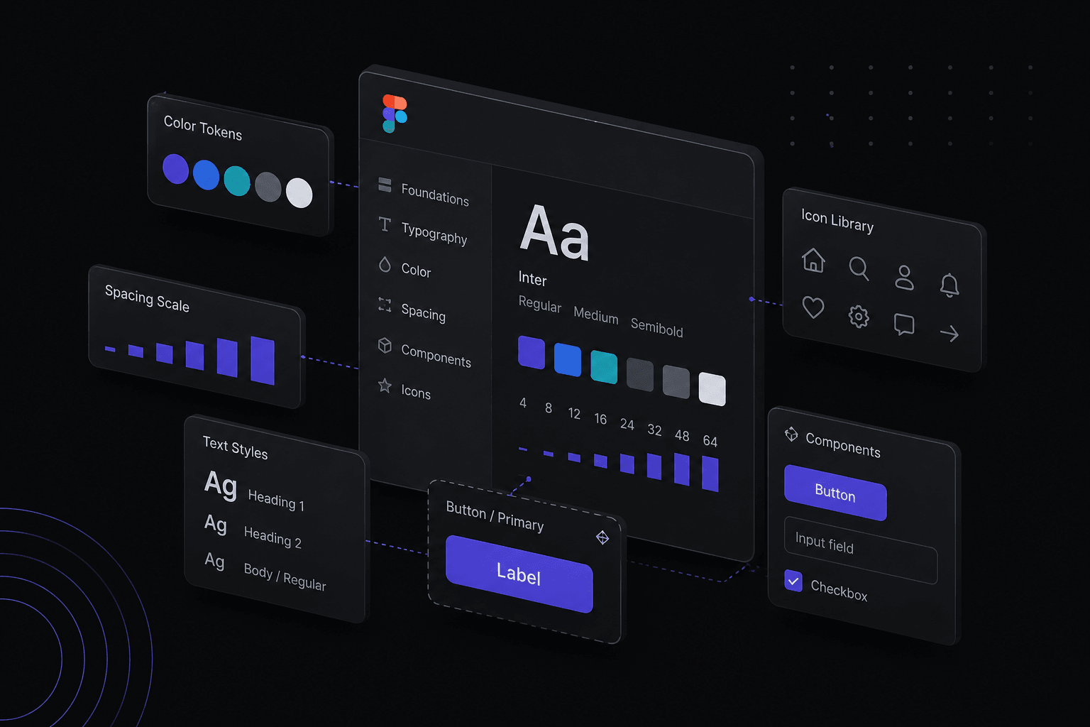
Primitives are raw values with meaningless names: grey/100 through grey/900, blue/500, space/4. Semantics describe intent and point at primitives: surface/default, surface/raised, text/primary, text/muted, border/subtle, action/primary. Components only get their own token when a value is truly local, like the specific height of your date-picker cell.
The reason for the middle tier is themes. When a client asks for dark mode, you add a second mode on the semantic collection and remap it to different primitives. Nothing in the component library changes, because no component ever references grey/800 directly; it references surface/raised. If your components point at primitives, dark mode is a rebuild rather than a remap.
Name tokens in the order category/role/variant, all lowercase, with slashes for grouping. It reads well in the Figma sidebar and it converts cleanly to the nested objects a Tailwind theme or a CSS custom property file expects.
Type and spacing scales you can defend
A type ramp of six to eight steps is enough for most interfaces: display, heading levels one to three, body, small, and caption. Each step should be visibly different from the one next to it. If you have to squint to tell two sizes apart, one of them is decoration, not hierarchy.
Set line height as part of the style, not as a per-instance override. Long-form text wants roughly 1.5 to 1.6; headings want 1.05 to 1.2. Bake tracking into large sizes too: display type almost always needs negative letter spacing that body text does not.
For spacing, pick a 4px base and use a limited scale: 4, 8, 12, 16, 24, 32, 48, 64. That maps one-to-one onto Tailwind default spacing, which means a developer never has to write an arbitrary value like p-[13px]. If a layout only works at 13px, the problem is usually the layout.
One rule that saves more arguments than any other: spacing communicates grouping. Elements that belong together get less space between them than the gap separating them from the next group. Most "messy" interfaces are not badly styled, they are just evenly spaced.
Components: properties instead of a wall of variants
A button with forty variants for every combination of size, style, icon and state is a component nobody can find anything in. Use component properties instead: a variant property for style, another for size, boolean properties for the icon slots, and instance swap properties for the icons themselves. Four properties describe the same forty combinations and stay legible.
Name those properties the way the front end will name its props: size, variant, state, disabled, leadingIcon. When the Figma property panel and the React prop signature use the same words, handoff conversations stop being translation work. It costs nothing at build time and it pays off on every ticket afterwards.
Build every component with auto layout, including the ones that look like they do not need it, and set the resizing behaviour deliberately: fill for anything that should stretch, hug for anything sized by its content. Auto layout is the closest thing Figma has to flexbox, so a component laid out properly in the file is a component that has already answered the developer's layout questions.
Also design the states people forget: hover, focus, disabled, loading, and the version with text long enough to wrap. A component that only exists in its ideal state is not a system component, it is an illustration of one.
Documentation that lives in the file
Nobody reads a separate documentation site for an eight-component library. Put the guidance where the work happens: fill in the description field on every component and every style, because it surfaces in the assets panel and in Dev Mode exactly when someone is deciding what to use.
Add one page of paired do and do-not frames for the components that get misused most: usually buttons, form fields and empty states. A pair of small screenshots settles a question faster than a paragraph.
Keep a short changelog page at the front of the file with dates and one-line entries. On a client project this is also your evidence trail: when someone asks why a colour changed in March, the answer takes ten seconds.
Finally, use branching for anything structural. Renaming a variable collection or restructuring a component in the main file mid-sprint breaks live instances across every product file, and the person who finds out is always a developer at the worst moment.
How to tell whether the system is actually working
A system is working if designing a new screen feels like composing existing blocks rather than drawing new shapes. The real test comes two months after launch: check how many components in the file are un-detached instances, how many colours come from the token palette, and whether a new team member can build a screen without asking where to find the primary button.
If the answers are high, the system is doing its job. If not, cut half the tokens and try again.