Cleaning Services App
An on-demand home cleaning booking app concept: category-first browsing, a draggable before-and-after comparison, slot scheduling with a carried-forward address, and a bookings list with live status.
- Type
- Concept project, self-initiated
- Role
- UX and UI design
- Platform
- iOS and Android
- Tools
- Figma
Selling a service you cannot photograph
A cleaning service has no product shot. The thing being bought is a change of state, which is hard to put in a card and impossible to judge from a price alone. That is why this whole category leans so heavily on reviews.
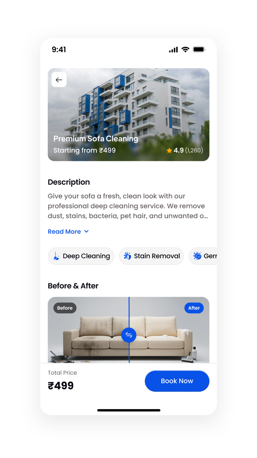
So the service page leads with a before-and-after comparison on a draggable divider. It is the one control on the screen that shows the outcome rather than describing it, and dragging it yourself is more persuasive than any pair of side-by-side thumbnails.
A light interface is the right call here for the opposite reason to the food app: the promise is cleanliness, and a bright, generously spaced, low-contrast layout is that promise expressed in the interface itself.
Category first, because that is how people ask
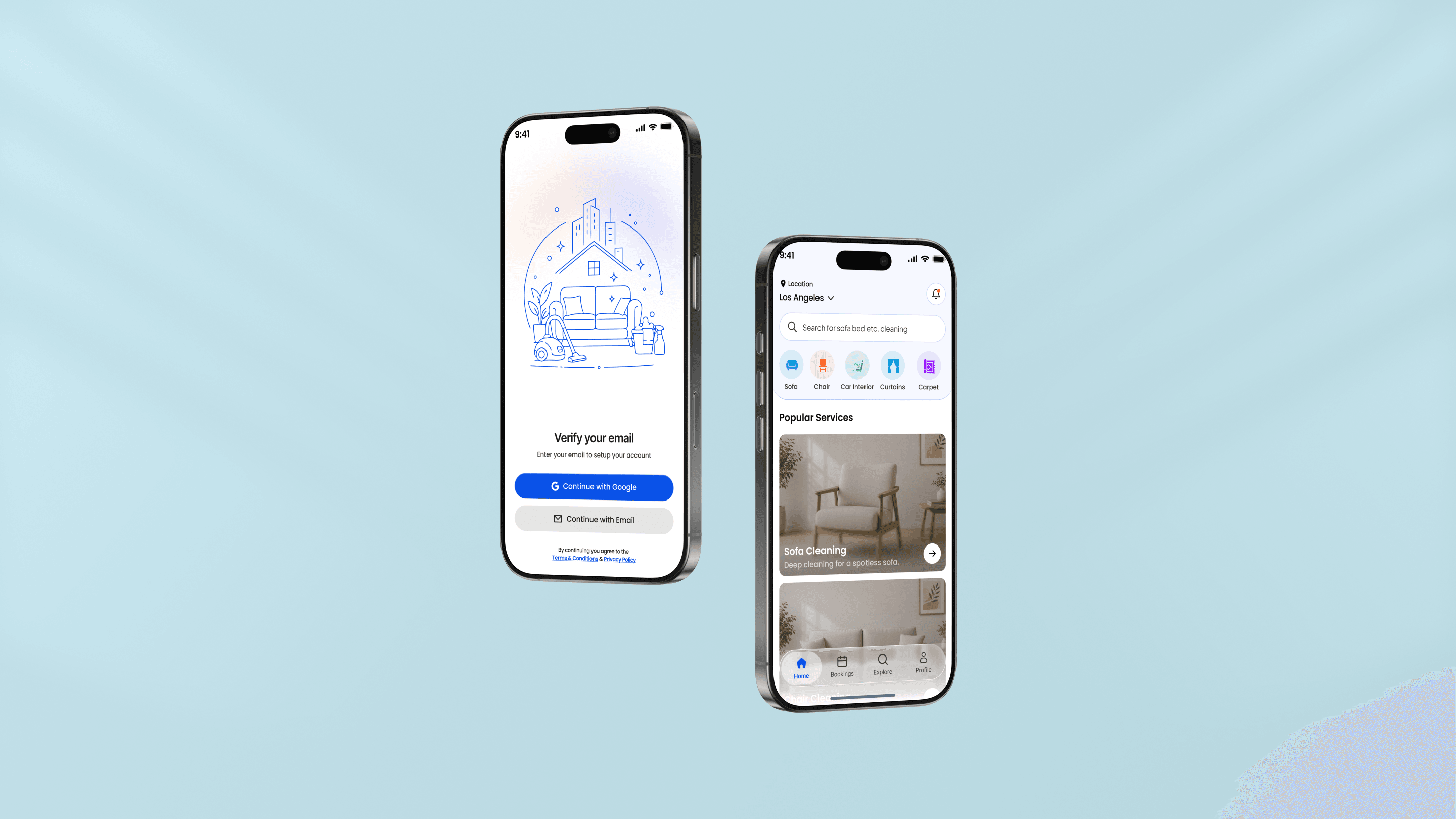
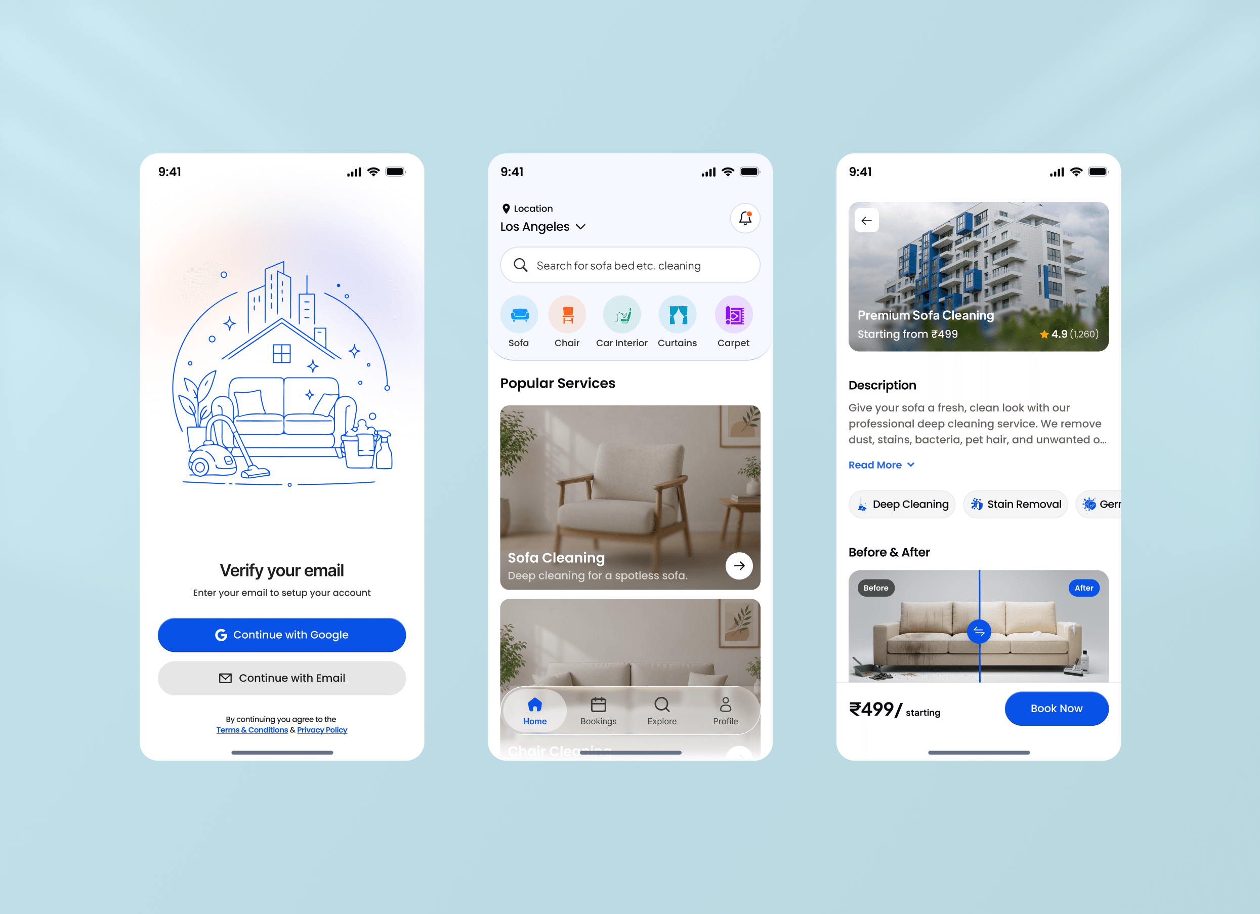
Nobody wants "a cleaning service". They want the sofa done, or the car interior, or the carpet. The home screen opens on exactly that: a row of illustrated category chips for sofa, chair, car interior, curtains and carpet, above a search field primed with the same phrasing.
Popular Services then repeats the entry point as full-width photographic cards, so the same choice is available whether someone is scanning icons or reading.
Location sits at the top as a dropdown rather than a setting. Availability and price both depend on it, so it belongs where it can be checked and changed in one tap.
A price that never leaves the screen
The starting price appears on the service card, again on the detail hero, and again in a sticky footer beside Book Now. The repetition is the point: the most common reason people abandon a services booking is not knowing what it will cost until the last step.
The detail page keeps the description truncated behind Read More and puts the scannable facts above it: rating, review count, and tags for what is included. Long-form copy stays available for the people who want it and out of the way of the people who do not.
Onboarding is a single screen: verify your email, continue with Google or email, terms underneath. It runs before booking rather than before browsing, so nobody hits an account wall while still deciding.
Scheduling, and what happens after the job
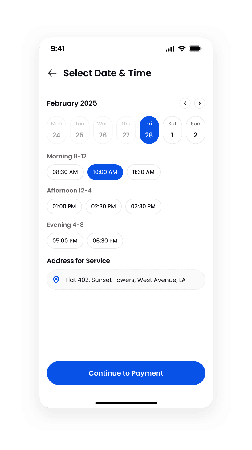
Picking a slot is where most services bookings fall over, usually by presenting a bare calendar and a list of every time in the day. Here the week runs as a strip with past days greyed out rather than hidden, so the disabled state teaches the boundary instead of leaving someone to work out why yesterday is missing.
Times are grouped into morning, afternoon and evening bands rather than listed as a wall of thirty-minute increments. People book by part of day first and by exact time second, so the interface asks in that order. The service address is carried forward and shown inline, because the last thing anyone wants at the point of confirming is to be sent back to a settings screen.
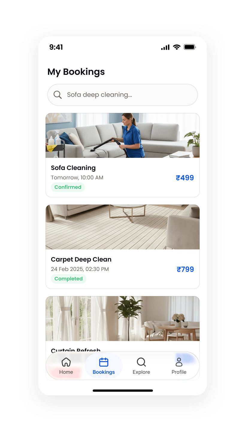
The flow then continues past the booking, which is the half most concept projects skip. My Bookings gives every job a status pill (confirmed, completed) next to its date and price, so the list answers "what is happening and what did it cost" without opening anything.
What it produced
A booking flow covering most of the lifecycle rather than just the sales pitch: onboarding, category browsing, the service detail page, slot selection with a carried-forward address, and a bookings list with live status.
It is unbuilt and untested, and no booking numbers are claimed. What it works through are two real problems: how to sell something that has no product image, and how to keep a services flow honest about price and timing at every step instead of at the last one.
Further reading
- 8 UI Design Mistakes Killing Your Product (and How to Fix Each)The same 8 issues show up in nearly every product I audit — contrast, spacing, hierarchy, states. Here’s the exact fix for each, with tests you can run today.
- Core Web Vitals in 2026: why site speed still wins dealsA practical look at Core Web Vitals in 2026: the LCP, INP and CLS thresholds that matter, where they actually break on real client sites, and the fixes that move them fastest.