Mobile app UI that feels native on both platforms
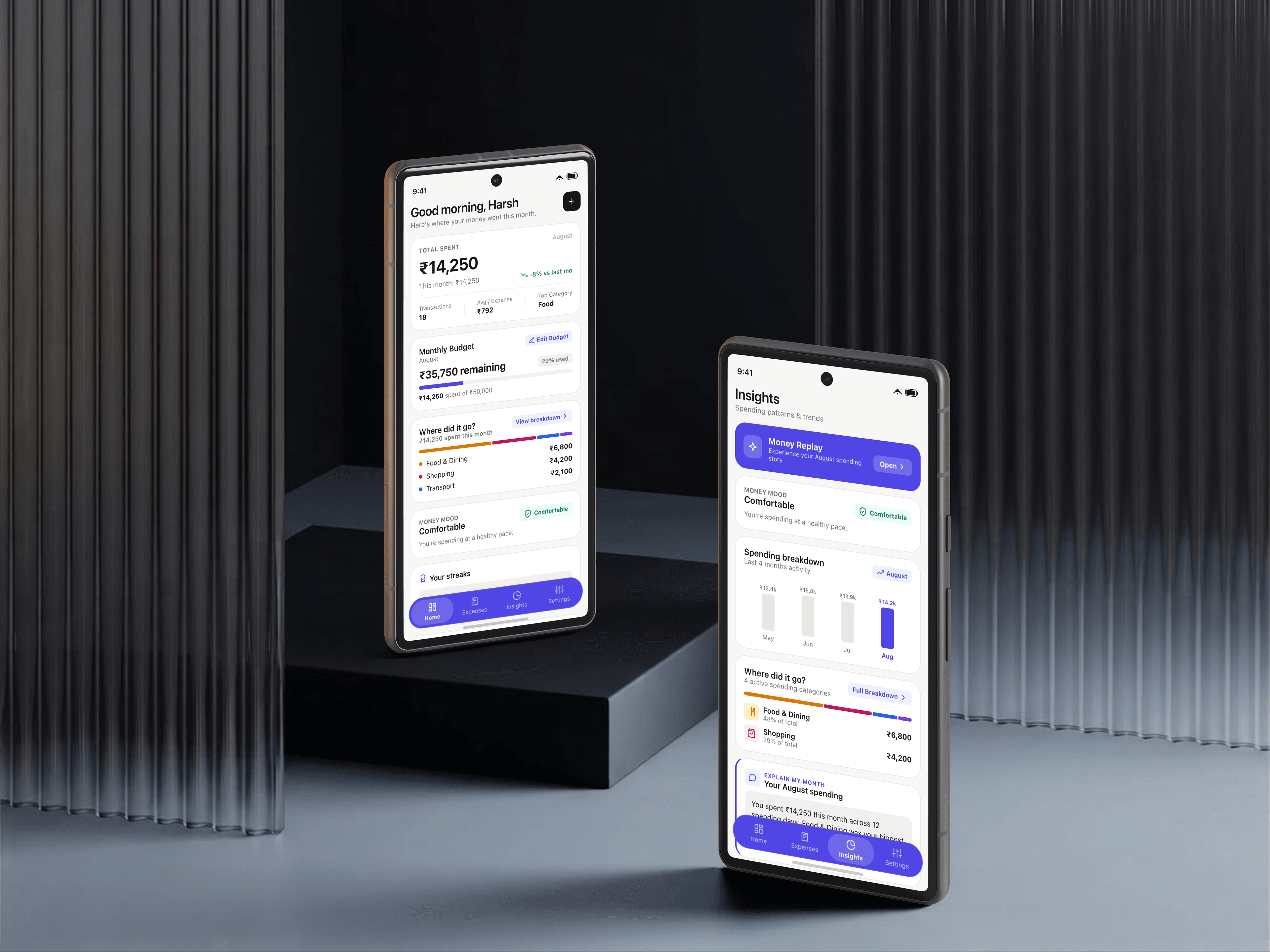
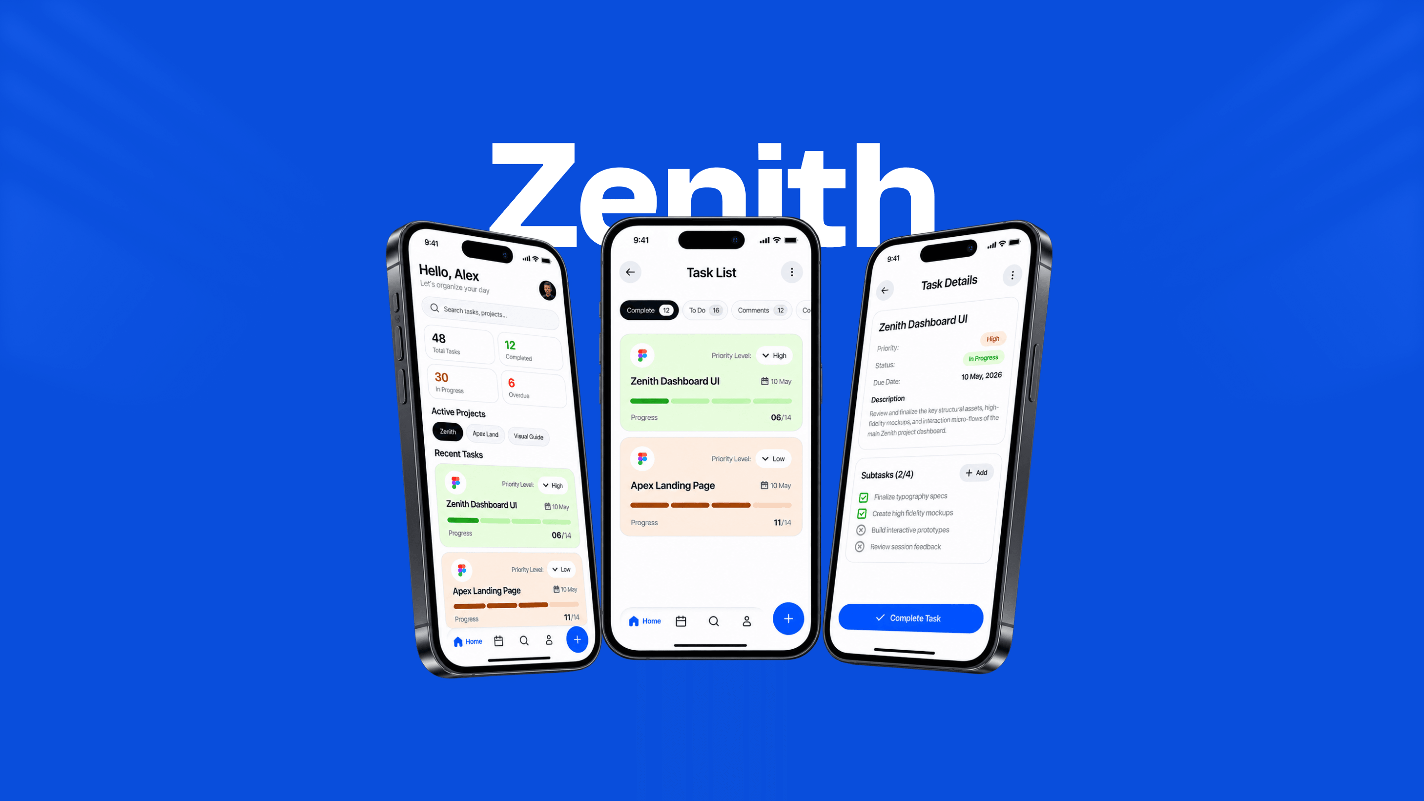
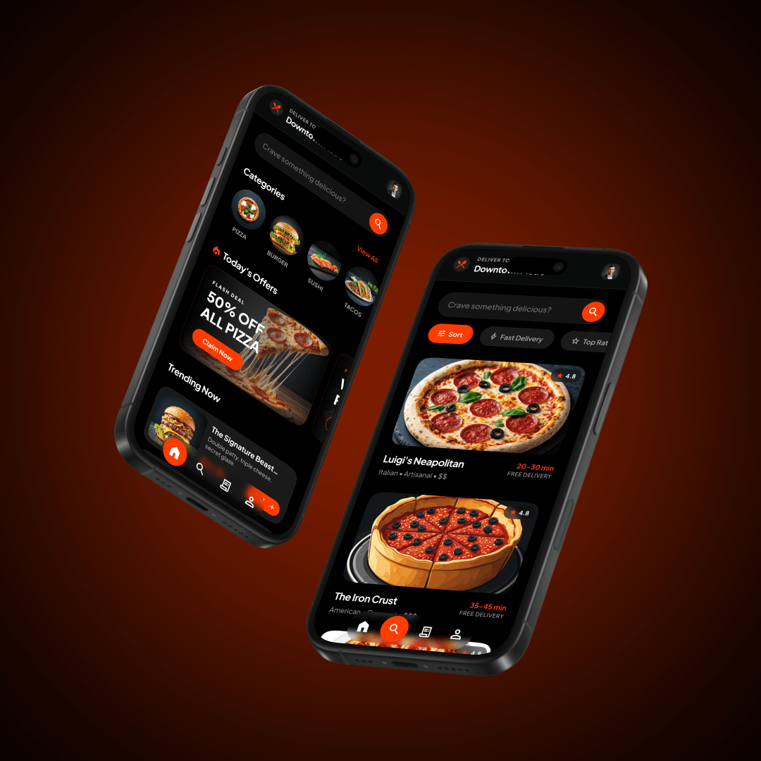
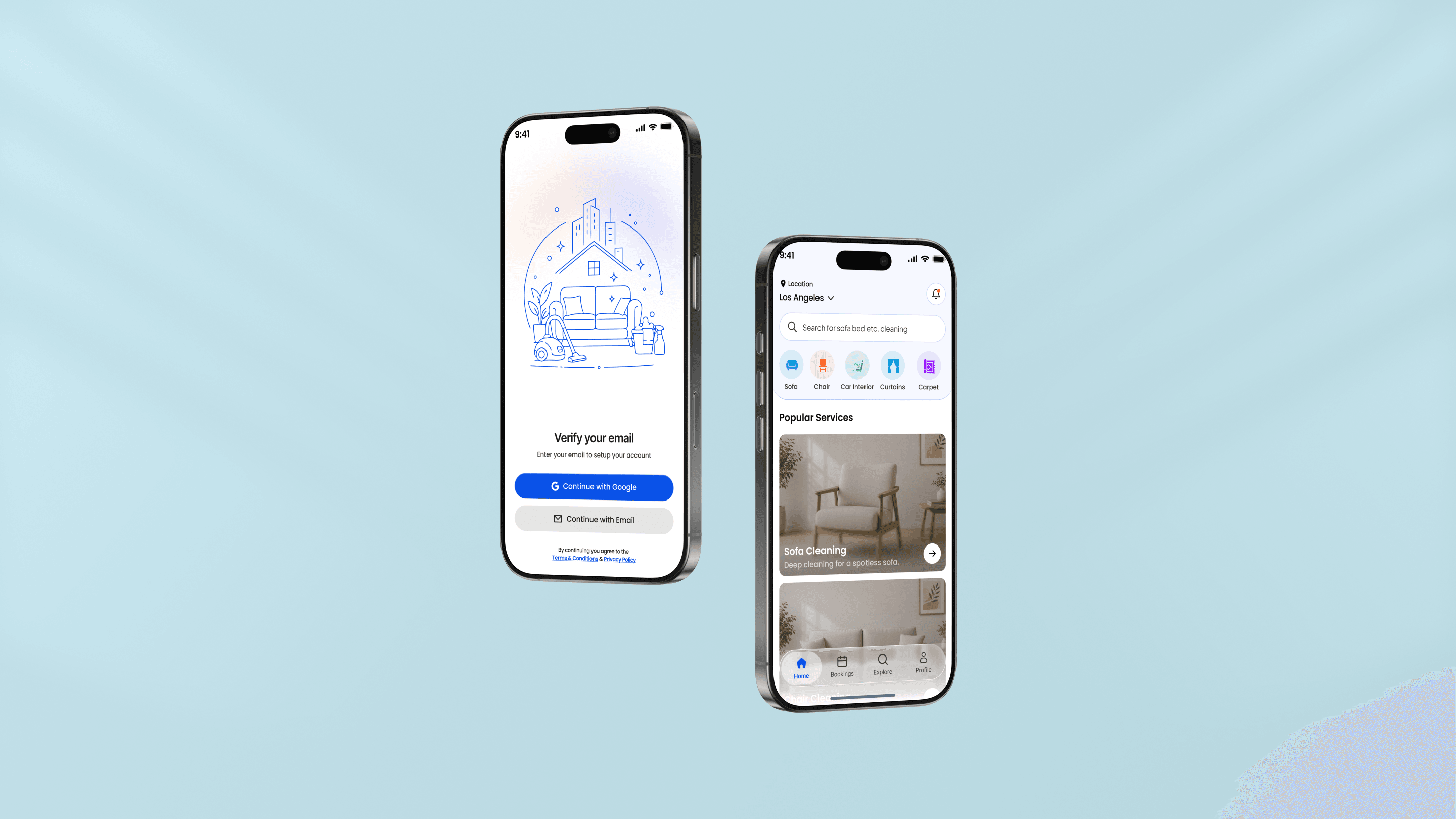
Mobile interfaces designed in Figma to Human Interface Guidelines and Material Design, with real navigation patterns, proper tap targets and the edge cases accounted for before a developer writes the first screen.
What you get
- iOS and Android screen designs in Figma
- Interactive prototype for testing and stakeholder reviews
- Component library with states, edge cases and icon assets
Respect the platform conventions
iOS and Android have different navigation models, back button behaviours, bottom sheets and modal patterns. Designing one screen and stretching it across both is the easiest way to make an app feel foreign on both.
The designs use platform-native patterns where they help muscle memory and custom UI where your product needs its own identity.
Design for the thumb, not the cursor
Tap targets that meet accessibility minimums (at least 44x44 points), critical actions placed within easy thumb reach, and destructive actions protected against accidental taps.
Every interactive element is given clear pressed, disabled and loading states so the user is never left wondering whether a tap registered.
Prototypes that answer real questions
Clickable Figma prototypes let you test transitions, sheet behaviours and flow logic with stakeholders and users before engineering begins.
Handoff includes redlines, exportable assets in 1x/2x/3x and SVG, and component documentation ready for React Native, Flutter or native iOS/Android teams.
Common questions
Do you build native mobile apps too?
No. I focus on UI/UX design for mobile applications. For the build stage, I deliver complete Figma design files with documented tokens, assets and component specs ready for your mobile development team (React Native, Flutter, Swift or Kotlin).
Can you design for both iOS and Android?
Yes. Most mobile projects cover both platforms, starting with a primary platform (usually iOS or Android depending on your audience) and adapting platform-specific patterns for the second.
How do you handle dark mode for mobile?
Both light and dark modes are designed against a unified semantic token system. Dark mode is not an afterthought inversion; it is designed with intentional contrast, elevation shadows and readable typography.
Other services in this area
Already have the design, and need it built? Custom development
Have a project in mind? Let’s talk.
Get in touch