Web UI design that holds up on every screen size
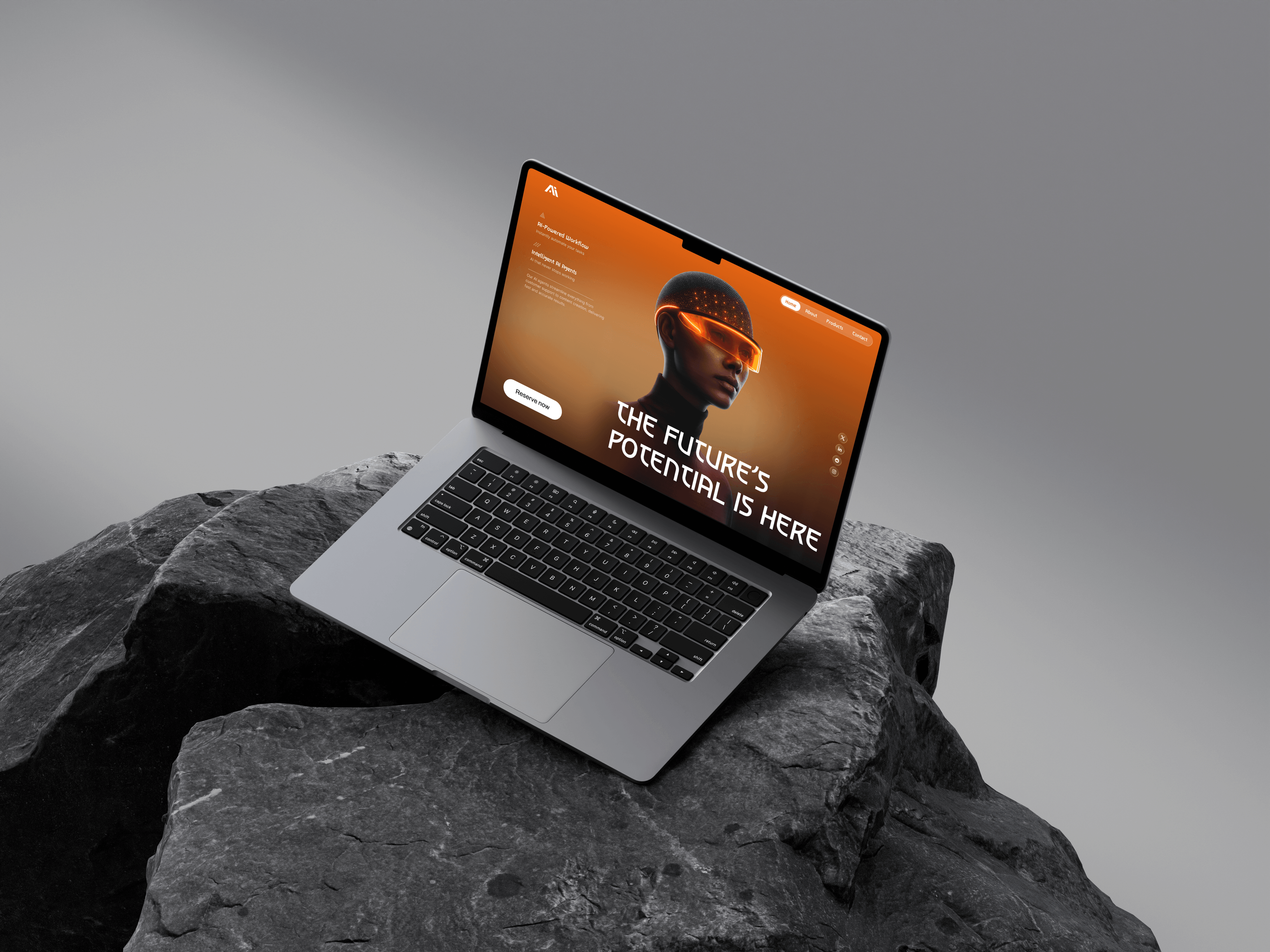
Landing pages, marketing sites and web app screens designed in Figma on a grid, type scale and spacing system that survives contact with real content, not a hero shot that falls apart on the second page.
What you get
- Responsive page designs in Figma, desktop through mobile
- Landing page, marketing site and web app screen design
- Typography, spacing and component structure ready to build
A system before a screen
Most website designs break the moment a second page is added, because the first page was drawn rather than structured. I start with the grid, the type scale and the spacing steps, so every page after the homepage inherits decisions that were already made once.
That means the design file stays usable after handoff. New sections drop into an existing rhythm instead of needing a designer back to redraw them.
Responsive as a starting point
Desktop, tablet and mobile are designed together, not adapted afterwards. Breakpoints are chosen around where the content actually stops working, rather than around device widths that stopped being accurate years ago.
Long headlines, short headlines, missing images, eight nav items instead of four: the layout is tested against the awkward cases while it is still cheap to change them.
Built to be built
Because I also write front-end code, the file that gets handed over is one a developer can read: components rather than detached groups, auto layout that maps to how CSS actually behaves, and tokens for colour, type and spacing.
If you would rather not hand it over at all, the same project can continue into a coded build. See Figma to React build.

Common questions
Do you design in Figma or another tool?
Figma by default, because it is what most development teams already work with and it makes review and handoff straightforward. I also work in Framer, Webflow and Sketch when a project or an existing team is already committed to one of them.
How many revision rounds are included?
Review happens at each stage rather than in one round at the end, so feedback lands while it is still cheap to act on. The exact number of rounds is written into the scope before the project starts, so neither of us is guessing halfway through.
Can you work with our existing brand guidelines?
Yes. If you already have a logo, palette, typefaces or a brand book, the UI is designed inside those constraints. Where the guidelines do not cover something an interface needs (states, data density, error messaging), I extend them in the same spirit rather than inventing a second visual language.
Other services in this area
Already have the design, and need it built? Custom development
Have a project in mind? Let’s talk.
Get in touch