AI Agent Landing Page
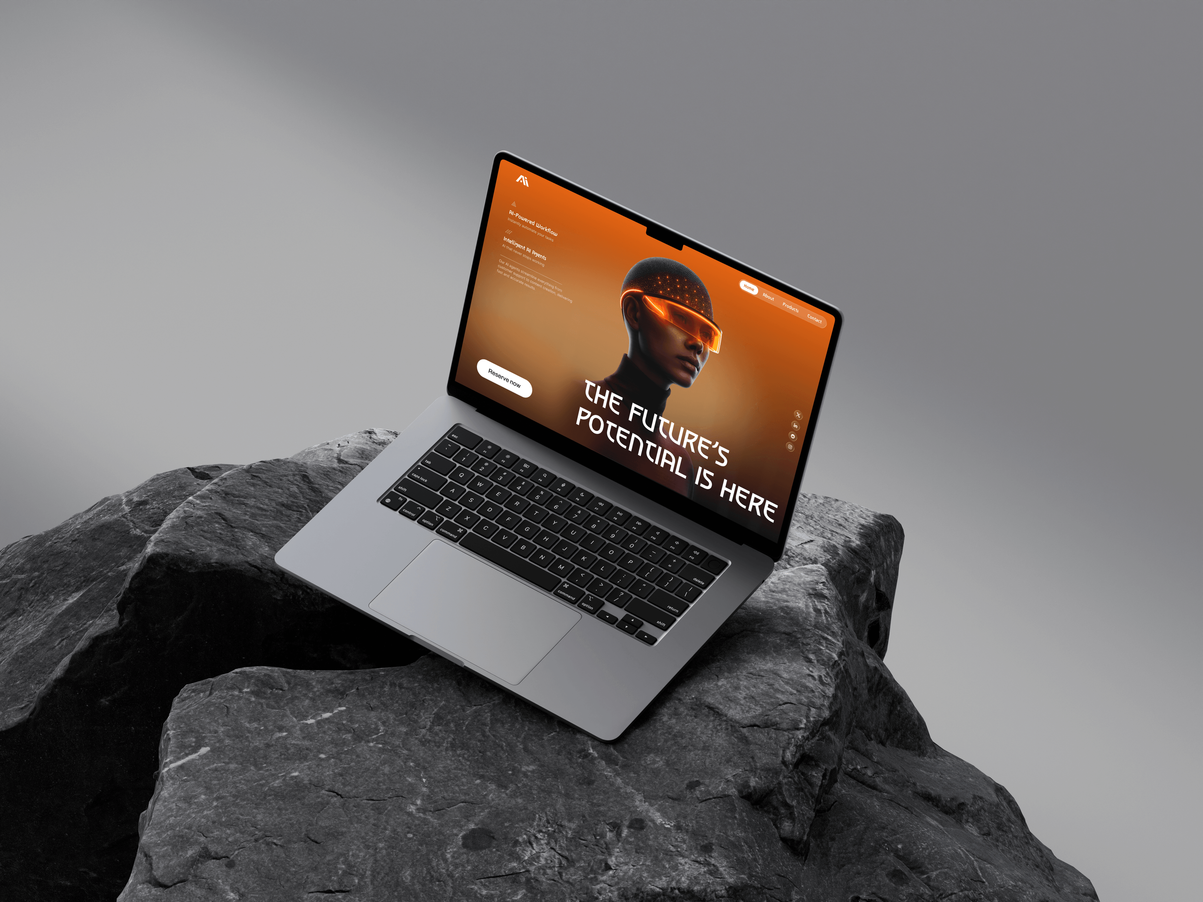
A landing page hero concept for an AI agent product: a display typeface, one orange gradient and a benefit-led left column, designed as a first-screen exploration rather than a full site.
- Type
- Concept project, self-initiated
- Scope
- Hero section only
- Platform
- Desktop web
- Tools
- Figma
One screen, deliberately
This is a hero section, not a website, and the case study says so rather than padding itself out with a research phase that never happened. It exists to work through one question: how a product in a crowded, abstract category makes an impression in the first screen.
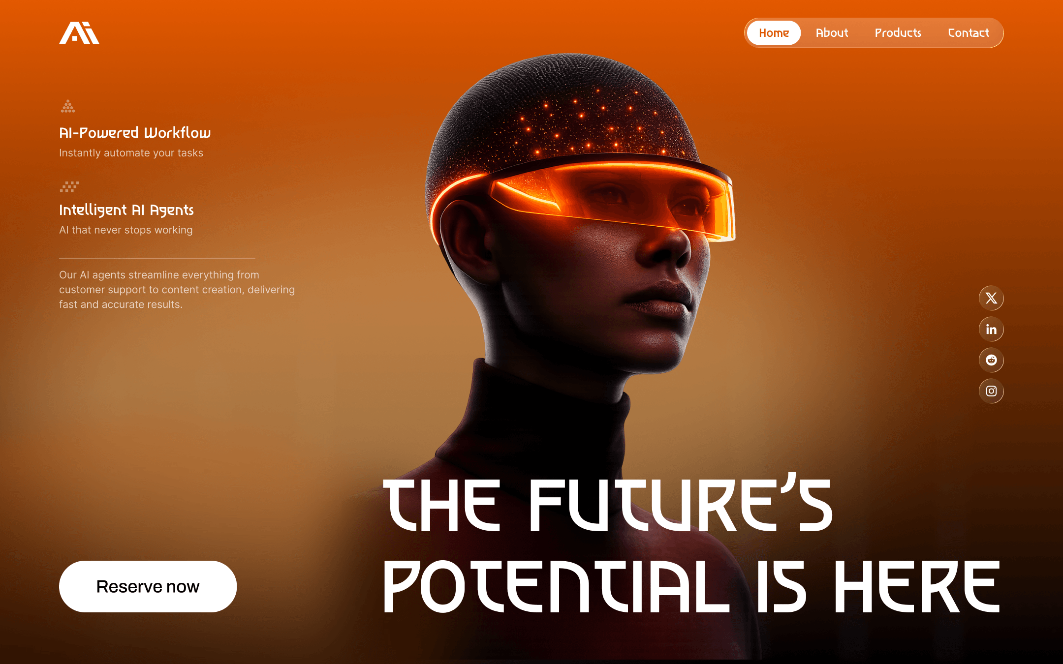
AI products are hard to photograph. What is being sold is a capability, so most of the category settles for gradients and node diagrams. The approach here is to put a face on it. A single portrait with a glowing visor gives the page a subject and a focal point, and the warm gradient behind it does the mood work an abstract illustration usually fails at.
Splitting the argument from the atmosphere
The left column carries the actual claims (AI-powered workflow, intelligent AI agents, each with a one-line explanation and a short supporting paragraph), set in a plain, readable weight. The display headline is the atmosphere, and it stays out of the way of the reasoning.
That split is what lets the type be as loud as it is. A wide, geometric, slightly futuristic face is a strong choice that becomes unreadable at paragraph length, so it is confined to four words across the bottom of the frame while the substance is set in something that behaves.
A single white pill CTA anchors the bottom left, sitting against the darkest part of the gradient so it holds the highest contrast on the page. Social links run down the right edge as a vertical rail: present, without competing for the centre.
What it produced
A finished first screen: navigation, a two-point benefit column, a display headline, a primary call to action and a social rail, resolved as one composition on a single gradient.
The scope is the honest part of this one. It is a visual exploration of a hero section, useful for what it settles about type pairing, contrast and where to spend a single accent, but not a product design project, and not presented as one.
Further reading
- Figma to React: a handoff that does not get rebuiltWhy Figma to React handoffs produce code that gets rewritten, and the workflow (token mapping, prop-shaped properties, real states) that prevents it.
- AI coding tools in 2026: what changes on a client buildWhere AI coding assistants genuinely speed up client front-end work in 2026, where they quietly cost time instead, and how code review has to change either way.